Advancing the Reading Ecosystem Toward a Future of Personalized Reading:
Human Factors Research + IT Systems Promise Value for Education, Business and Individuals
Kathy Crowley and Marjorie Jordan
May 7, 2019
Kathy Crowley and Marjorie Jordan
May 7, 2019
It is well proven that small changes to text format impact reading speed and accuracy for individuals. Further, the speed of accurate reading, “reading fluency,” directly correlates to comprehension. Ubiquitous technology creates the opportunity for personalized content delivered to individuals. Reading is accomplished on a host of digital platforms and applications. Currently, there is no infrastructure to allow support of individually best reading formats at scale. Significant innovation is required. Combining existing technology in new ways to improve reading proficiency increases learning, work accuracy, and reading enjoyment. Existing technologies must be combined to form scalable infrastructure, allowing each reader to read with their individually best format without creating a burden on the content creators, educators, or readers to manage the formatting. These systems must be implemented at no cost to the reader.
Since the 1960s, researchers have proven that small changes to text format significantly impact reading speed and accuracy for individuals. [1,2,3] Reading fluency is defined as the ability to read with speed, accuracy, and proper expression. [4] Fluency is measured as words correct per minute (WCPM) read.[5] Fluency is the bridge to comprehension.[6,7,8]
 Our work demonstrates that readability formatting changes can make both adults and children faster, more accurate readers. These changes can increase an adult’s speed of accurate reading by 20% or more, and that of children up to 50% or more. In short,
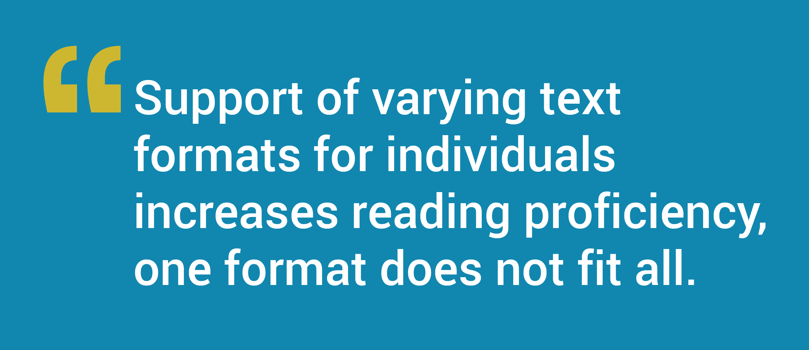
Support of varying text formats for individuals increases reading proficiency, one format does not fit all.
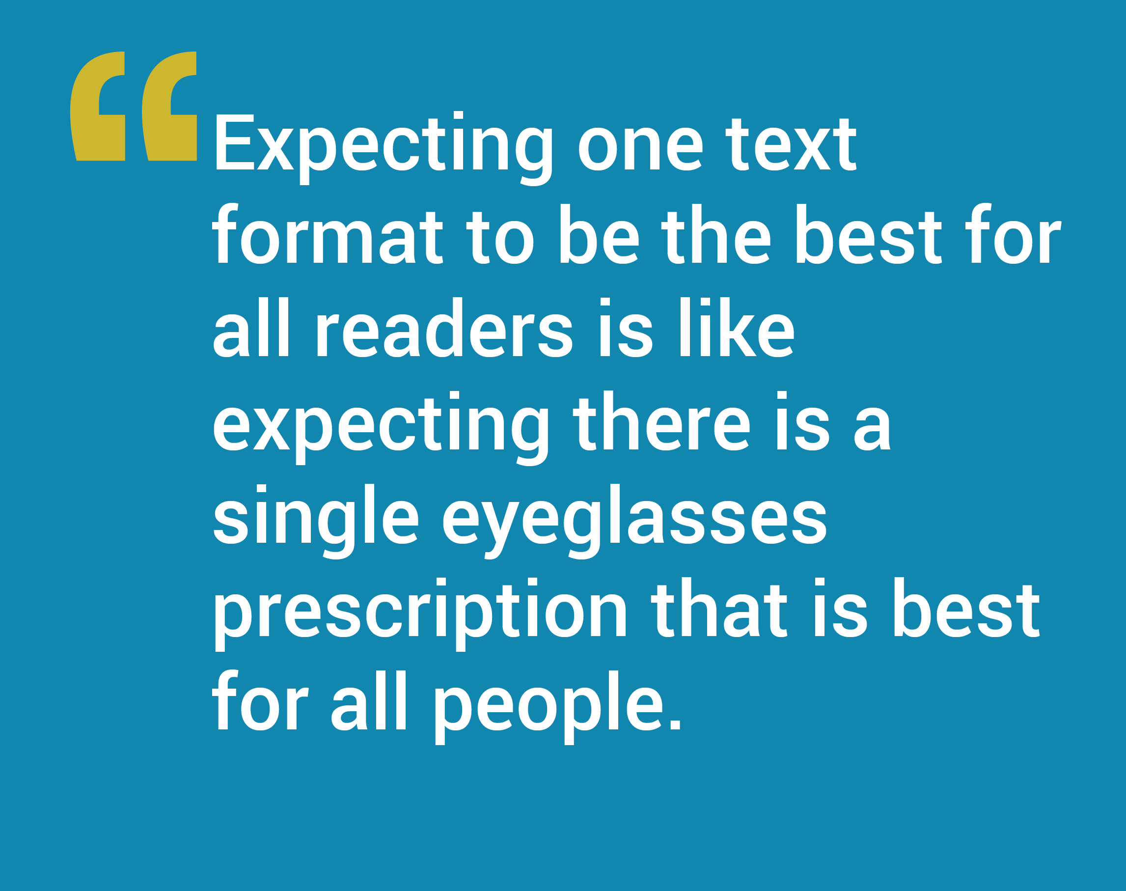 A reader with the perfect pair of eyeglasses offers an analogy. For readers who need them, the eyeglasses provide instantaneous change to text readability. Likewise, making subtle changes in text format (“tuning the text”) for the individual can deliver immediate, meaningful improvement in reading speed and accuracy. Expecting one text format to be the best for all readers is like expecting there is a single eyeglasses prescription that is best for all people.
The paper-based model for the dissemination of reading material has logical limits. Except for large print books, publishers have not created multiple formats to accommodate better experiences for all readers. The one-format-fits-all model of publishing has been carried into the digital environment.
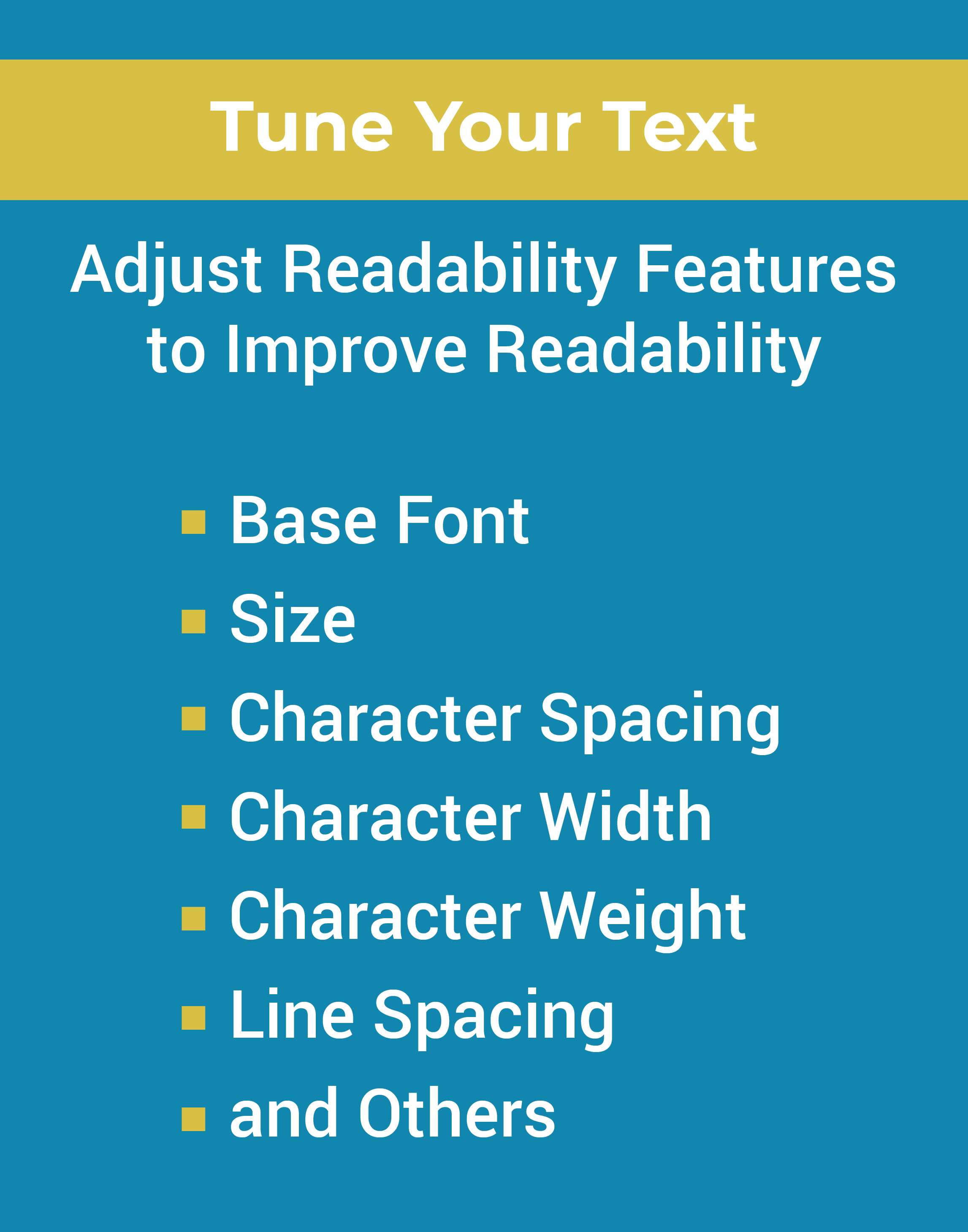 Readability of text is evaluated based on the content of the material, and the formation of the text characters. This paper deals with the later. Readability Features include character shape (base font determines character shape and also weight; additional features can provide width expansion of characters), size (the size of the characters), spacing (inter-character space and line space) and background color (black on white, or white on black text).
A strong advocate for Readability Features, Dick observed a “conflict occurs when (1) the visual semantics of the author conflict with the typographic needs of the user, and (2) there is no feasible resolution of this conflict.” [9] Digital technology, with the ability to separate the content from the text format, delivers the resolution to the conflict he described. Readability Features are slowly being added to reading applications, frequently allowing users to change text size, and in some cases, change the base font, margins or background color.
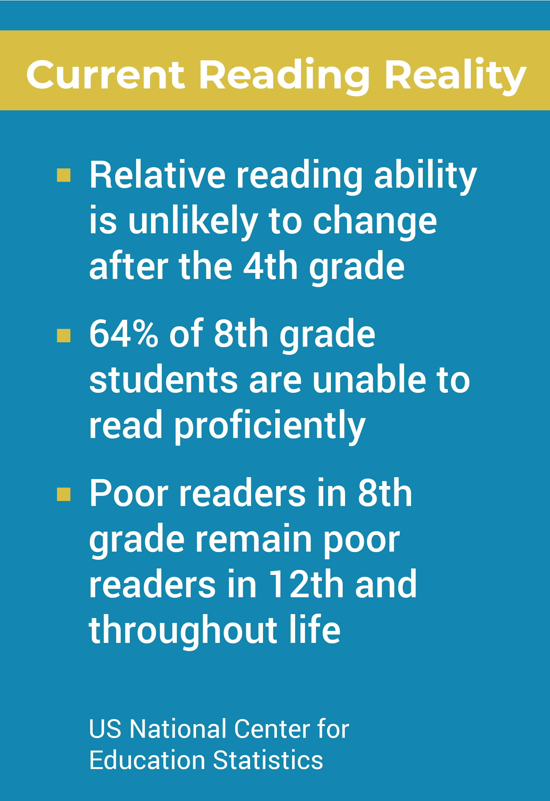 Just over one-third of the United States reads at a proficient level, according to the US Department of Education. The unfortunate trend begins when children are learning to read; the relative patterns are set by the 4th grade. If the student does not read well by 4th grade, he or she is not likely to read well in the 8th, in 12th, and throughout life. Tuned text offers the opportunity to shift this trend, adding an important enhancement to the educator’s instruction.
Seeing a child respond with a 51% gain in speed of accurate reading, one author took on the task of making subtle changes to text format, creating better reading experiences for the child over time, and shifting the learning trajectory. A young adult aware of proficiency improvements possible made her own subtle changes to text format, easing the reading load in a top university. Highly educated adults have been tested and found to experience instantaneous proficiency gains from subtle text format changes. Classroom tests have generated the same results. [10]
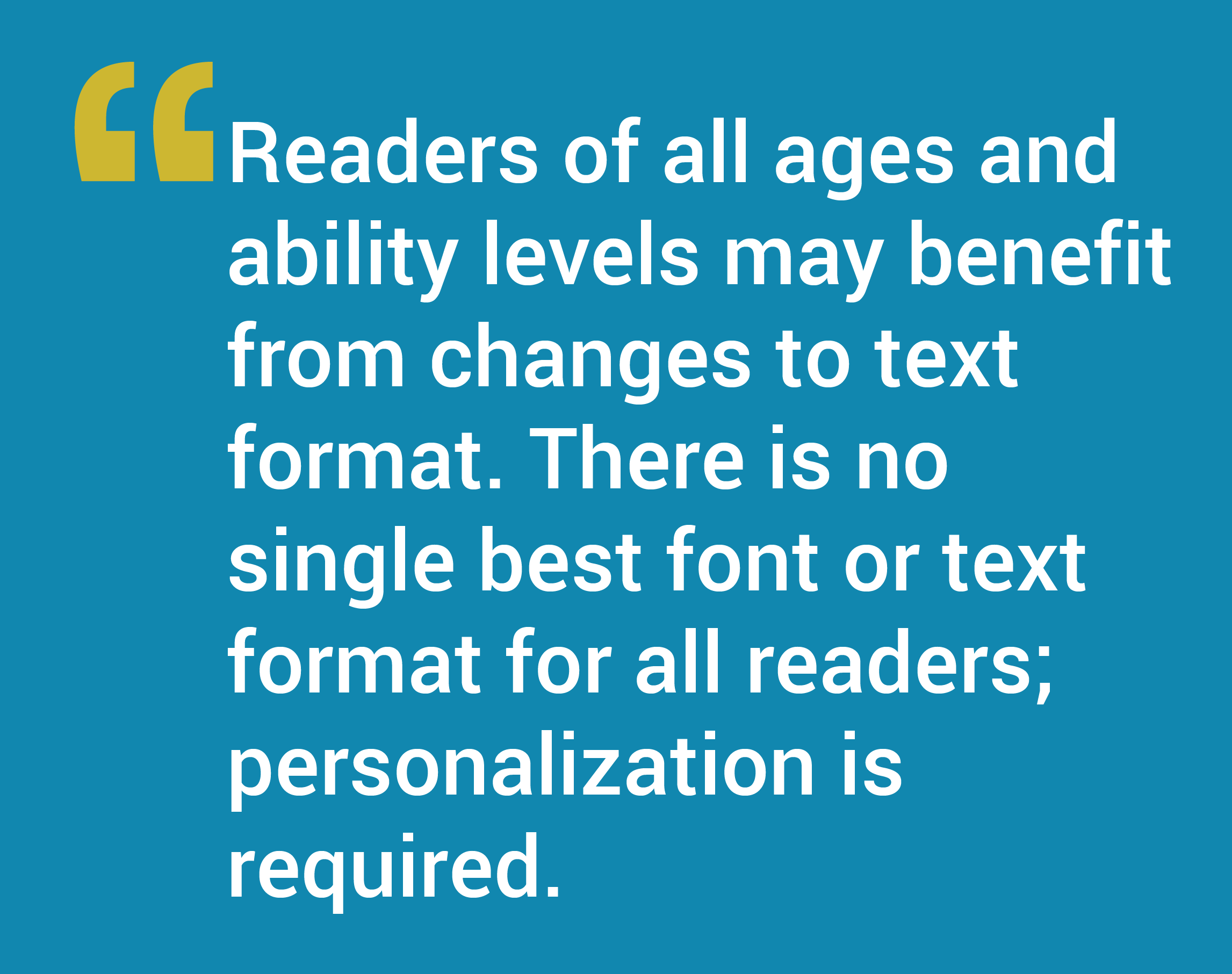 Readers of all ages and ability levels may benefit from changes to text format. There is no single best font or text format for all readers; personalization is required.
Readability Features are a critical offering; however, they are only a piece of a much larger ecosystem required to support individual reading formats. Adding Readability Features to reading applications is not technically challenging. A significant problem is getting access to reflowable content. For content to move from the author to the reader in a format that can be reformatted requires intentionality.
In the best case, the publisher chooses a reflowable format. HTML is an example of a reflowable format; HTML content will reflow on devices of different sizes. Similarly, it will reflow if enlarged by a user action, such as increasing the text size.
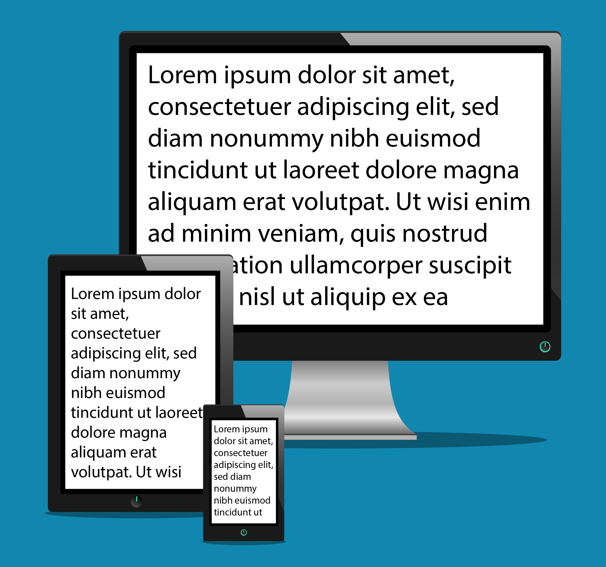 Unfortunately, there is no consistency or standard for presenting digital content. Readers are all aware of receiving digital content that does not reflow. For example, pinch and stretch actions cause the text to enlarge beyond the screen size, making it difficult to read. Additionally, some electronic text is delivered with an enlarge feature, but without reflowable text, causing the reader to have to scroll back and forth to read the content.
Digital Rights Management (DRM) concerns can drive publishers to deliver text in an un-editable picture format, rather than in a digital text format. When content is delivered in a text format, it often includes special characters that create issues for reformatting. Further, authors do not always tag text such that headers and other elements (images, tables, etc.) can be universally managed.
Here again, there is no consistency or standard for implementing Readability Features. Many reading apps offer users the capability to change text size. Some offer the ability to change base font, line spacing, and background color. Very few offer a full set.
Examples: Apple’s Reader View is promising; it offers choice of base font, size, and background color. Microsoft Immersive Reader delivers a character spacing option. Amazon and Google offer line spacing control; Amazon also includes margin control. [11] Readability Features continue to be added as more providers realize the reader benefits.
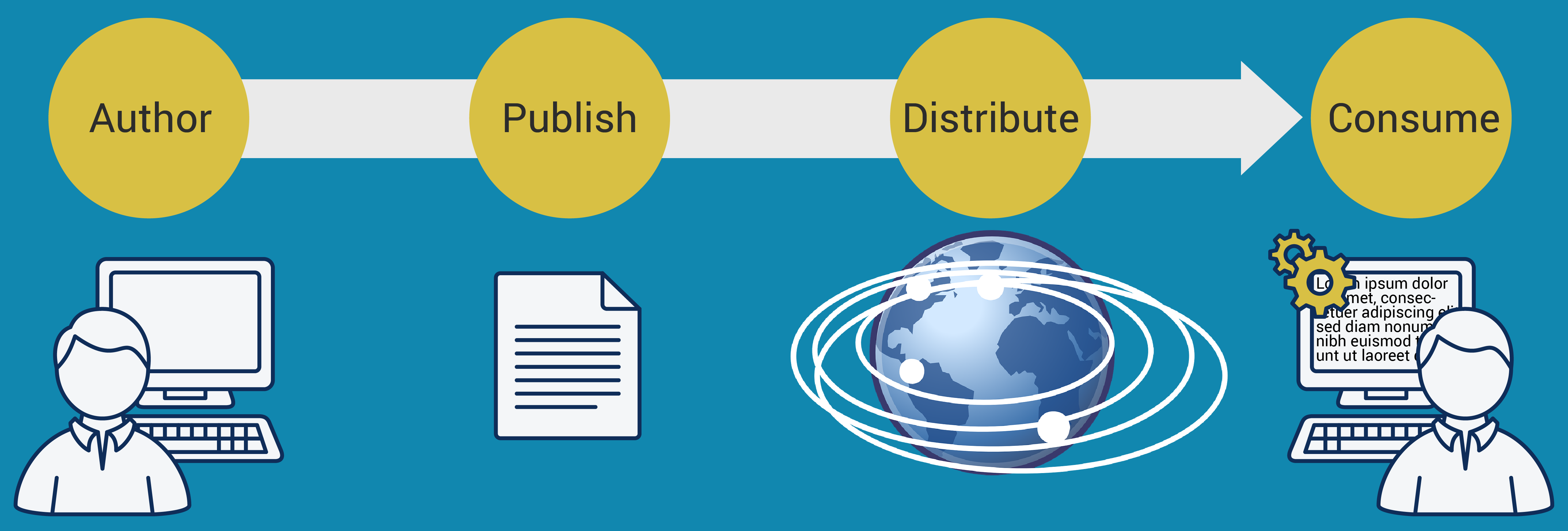
Readers typically consume information from multiple content sources, including websites and content applications across various platforms. Daily use of email and electronic documents add to the content. Each has different distribution and presentation mechanisms. These varied sources make it impossible to manage the reading material as a set.
Once establishing that a reader performs best with a given Readability Format, the set of text format settings must be stored for reuse. To get to scale for all readers across platforms, infrastructure is required. It is impossible to imagine the implementation of individually best reading formats in an educational setting without the capability to set the format for a reader once and reuse it.
The process of making text format changes for an elementary school student is possible only because their reading material is largely predictable. There may be a single reading textbook and a set of books for extra reading practice at home to manage. If it is known that a child reads better with a little character space added to the text, the material can be reformatted.
Even for young readers, the process is arduous at best. If the electronic text of a textbook is available, it often has a hard return at the end of every line that must be removed. It may have a string of characters in place of a special character (e.g., a string of 3 characters for every apostrophe in the text). In many cases, there is no electronic text readily available, and the task begins with scanning the text to begin the cleanup and reformatting process.
The determined individual (likely a parent) can make this happen with a scanner, a word processor, technical capability, and great quantities of time. An alternate scenario requires the parent to hire someone to complete the material preparation. The preparation must be done in concert with the educator, staying ahead of the need for material.
The older the individual gets, the quantity of expected reading increases, and the variation of sources becomes unmanageable. It is impossible to imagine that this process could work for an adult where a typical day may include reading email, documents, articles, news, etc.
Providing additional Readability Features with reflowable electronic text is a good first step. Reading applications should provide the reader with the ability to change the font, text size, character spacing, character width and expansion, and line spacing, for example.
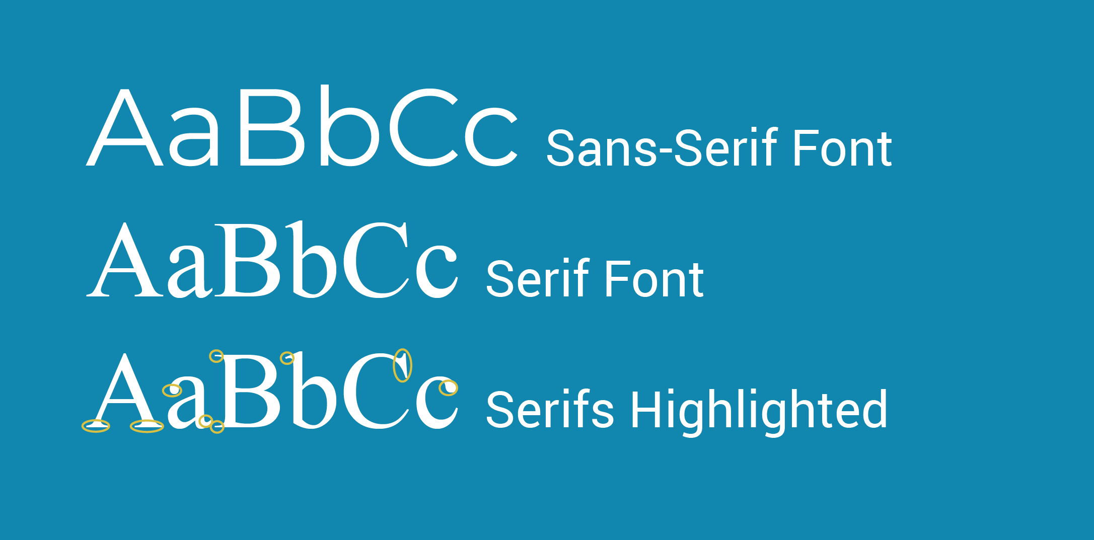
Creating the best font for the population is a worthy goal; base font is a significant piece of the readability puzzle. Research has shown there is not a single best font for everyone. Some read best with traditional serif fonts, while most read best with a sans-serif, geometric font. Some enjoy fonts with heavier stroke weights, while others need a lighter weight. Some read fastest with very little character spacing while others respond best with significant quantities of character spacing, (5 points or more.) These statements extend across the range of Readability Features.
Readability Matters uses the following model to assess reading user interfaces. The availability of a full set of Readability Features offers the reader the greatest opportunity to maximize proficiency.
 Good – Availability of a sans-serif, geometric font (Starting with a good base font delivers significant results.)
Better – A sans-serif, geometric font with additional formatting features
Best – A full set of Readability Features
An OpenType variable font can include defined variations within a single font. These fonts, announced by Adobe, Apple, Google, and Microsoft in 2016 [12,13,14] are useful to designers, but also have the potential to deliver readability enhancements to individuals. Variable fonts can be designed to offer control of multiple axes, including weight, character spacing, and character width. The fonts can now be built into operating systems and Web browsers or other applications, with specific readability formats selected at time of use.
To use a variable font for enhancing readability, (1) the variable font must be developed with the necessary readability axes, and (2) those axes controls must be exposed to the user. To the extent the variable font does not offer a full set of readability axes, such as line spacing and margins, additional Readability Features could be used with the variable font to deliver those features. This mixed model would add problematic complexity to the UI.
With development to offer profiles storing axes selections, these fonts could be used within a Readability supporting infrastructure.
Readability Matters will keep inviting big tech companies to make Readability Features available for all readers. As companies add features and profile capabilities there will quickly be a need for cross-company standards.
Likewise, content providers must be intentional to allow reformatting.
In the same way that Mozilla was formed to manage internet interoperability standards, a new standards body will be required to keep Readability Standards in sync.
Readability Matters imagines a world where everyone has easy access to reading material personalized to make them the best reader they can be.  Working on the technology side of reading, our purpose is to convene key technology partners to expand the availability of Readability Features in their products and on their platforms. Our strategies are (1) To build a movement, (2) Expand availability and (3) Ignite research and development.
In August 2015, Readability Matters Founder Marjorie Jordan proposed the idea of a full set of Readability Features and reader profiles as the basis of infrastructure to allow the scalability that would be required to take broad advantage of individually best reading formats. In 2016, conversations with reading application providers began. Given their advanced feature offerings at the time, Marjorie first approached YouVersion, gathering important new insights. In March 2017, she and Founder Kathy Crowley presented the concept to a large reading app provider. Since then, we have had conversations and shared insights with additional companies to expand the availability of Readability Features.
 Readability Matters is in conversation with researchers in Human Factors Engineering. (Human Factors is the interdisciplinary study that includes product design, human capability, and human-computer interaction. Human Factors researchers are concerned with user-technology interaction.) Given that education is a significant and high-value use case, we are working to drive research in that discipline as well. There is a significant opportunity to leverage technology to improve student outcomes. Readability Matters is forming interdisciplinary teams to engineer future reading solutions.
Together we can do more. Let’s put the option for enhanced readability into the hands of those who seek knowledge, learn in school, track trends, and enjoy reading.
Add readability Features to your application. Start with giving your users control over base font, text size, character and line spacing, and character width expansion.
We invite researchers to study Readability Features individually and in combination. Readers have shown their greatest gains with a combination of Readability Features. Readability Features are valuable for all readers; study children and adults, good and struggling readers. There are insights to be gained in for Human Factors work, and in leveraging technology for Education.
Please join us in asking your favorite content providers for Readability Features.
Stay in the loop. Register on ReadabilityMatters.org. Follow Readability Matters on social media.
Readability Matters advocates for the separation of content from text format. However, Readability Matters sees possibilities for preserving engaging design elements while still supporting the user’s best reading experience.
 Allowing a reader to designate a preferred format that includes a larger text size or additional character spacing would seem to include the requirement that the user takes over page control, and text is a single column of characters without the accustomed design elements of text and media. The page design can be preserved while allowing the reader to make use of their best reading format.
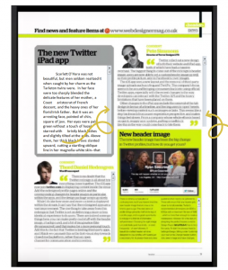
Consider the following mock-up of an electronic reading design UI, proposed to several tech partners in 2017. In this model the user’s profile takes control of text format for significant quantities of text, reflowing it within a text container, with the page layout and design remaining in place.
© Copyright 2019 Readability Matters. The information contained herein is subject to change without notice. Readability Matters shall not be liable for technical or editorial errors or omissions contained herein.
1 Erdmann, R. L., & Neal, A. S. (1968). Word legibility as a function of letter legibility, with word size, word familiarity, and resolution as parameters. Journal of Applied Psychology, 52(5), 403-409. http://dx.doi.org/10.1037/h0026189.
2 Legge G. E. & Bigelow C. A. (2011). Does print size matter for reading? A review of findings from vision science and typography. Journal of Vision. 11(5). 8. doi:10.1167/11.5.8.
3 Yu, Deyue Yu, Cheung, Sing-Hang, Legge, Gordon E. & Chung, Susana T. L. (2007). Effect of letter spacing on visual span and reading speed. Journal of Vision February 2007, Vol.7, 2. doi:10.1167/7.2.2.
4 Fluency is defined as the ability to read with speed, accuracy, and proper expression. In order to understand what they read, both children must be able to read fluently whether they are reading aloud or silently. When reading aloud, fluent readers read in phrases and add intonation appropriately. (ReadingRocket.com) A fluency test measures number of words correct per minute (WCPM) read.
5 https://www.readingrockets.org/article/understanding-and-assessing-fluency, retrieved 1 May 2019.
6 Lynn S. Fuchs, Douglas Fuchs, Michelle K. Hosp & Joseph R. Jenkins (2001) Oral Reading Fluency as an Indicator of Reading Competence: A Theoretical, Empirical, and Historical Analysis, Scientific Studies of Reading, 5:3, 239-256, DOI: 10.1207/S1532799XSSR0503_3.
7 Basaranm Mustafa (2013) Reading Fluency as an Indicator of Reading Comprehension DOI: 10.12738/estp.2013.4.1922.
8 Hudson, Roxanne F, Lane, Holly B & Pullen, Paige C (2005) Reading fluency assessment and instruction: What, why and how?, The Reading Teacher, Vol. 58, No. 8, 702-712.
9 Dick, Wayne E. (2012) Element Level Accommodation. Text Customization for Readability: Online Symposium. 19 Nov. 2012. Web. 15 July 2013, https://www.w3.org/WAI/RD/2012/text-customization/p10, retrieved on 01 May 2019.
10 Kathy Crowley & Marjorie Jordan (2019) Proof of Concept Results – Readability Matters. https://readabilitymatters.org/articles/proof-of-concept-results, retrieved 01 May 2019.
11 Information is subject to change.
12 OpenType font variations, Microsoft.com (2016) https://docs.microsoft.com/en-us/typography/opentype/font-variations, retrieved 01 May 2019.
13 Google, Apple, Adobe, And Microsoft are Quietly Developing a New Type of Font, Fast Company (2016) https://www.fastcompany.com/3064032/google-apple-and-microsoft-are-quietly-developing-a-new-type-of-font, retrieved 01 May 2019.
14 Brown, Tim. Variable fonts, a new kind of font for flexible design, Adobe Typekit Blog (2016) https://blog.typekit.com/2016/09/14/variable-fonts-a-new-kind-of-font-for-flexible-design/, retrieved 01 May 2019.