Advancing Readability Research
Highlights from the 2025 Vision Sciences Society Conference
Building on prior years of collaboration and momentum, the 2025 Vision Sciences Society (VSS) conference highlighted text readability as a critical area of investigation within vision science.

See the Highlights from the Readability Workshop.
In addition to a dedicated Readability Workshop, organized by The Readability Consortium (TRC), community researchers presented a series of posters that advanced understanding of how typographical design and perception shape the reading experience for individuals. The work demonstrates steady progress in understanding how text display can support diverse readers, expanding the evidence base for delivering better readability and informing the design of more effective and inclusive reading experiences.
See the following posters and abstracts below for highlights:
- Children’s Reading Ability Is Better Predicted by Foveal Crowding Than Acuity
- Crowding Predicts Reading Speed and Comfort Across Fonts and Participants
- Font Size, X-Height, and Readability: How Typography Affects Reading Speed Across Different Sizes
- Psychophysics of Variable Fonts: Do Multiple Font Features Interact to Impact Readability?
- The Impact of Font on Typo Detection: A Novel Visual Search Paradigm
- The Impact of Font Weight on Expressiveness Beyond Latin: Insights from Arabic and English
- Typography and Pupilometry: Exploring the Speed, Comprehension, and Concentration Trade-Off in Reading
The research presented advances the science required to support better reading for everyone.
To learn more about some of the researchers behind this work, read about the TRC Research Associates.
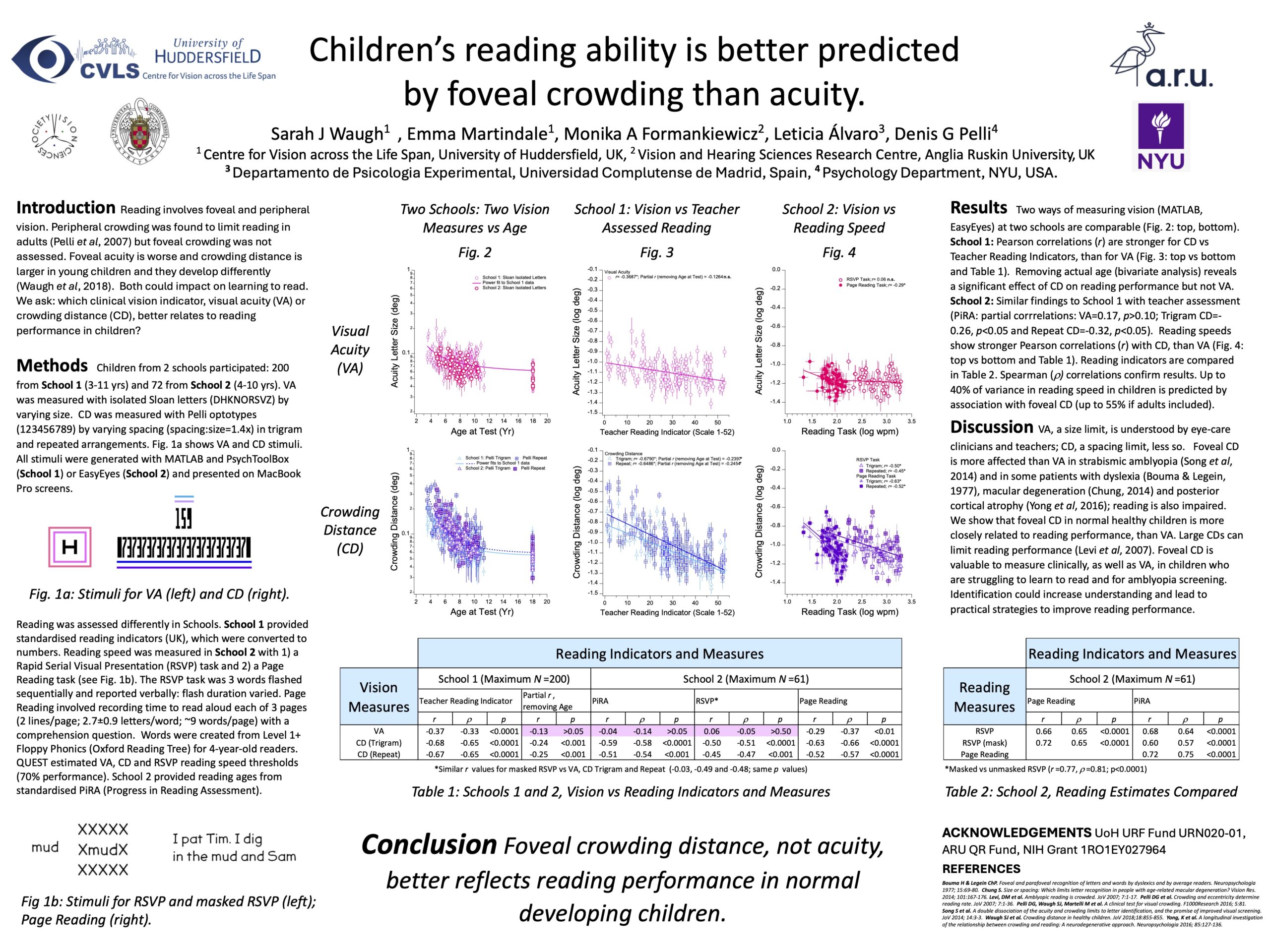
Children’s Reading Ability Is Better Predicted by Foveal Crowding Than Acuity
Sarah J Waugh; Emma Martindale; Monika A Formankiewicz; Leticia Álvaro; Denis G Pelli
Abstract
Click to enlarge
Visual acuity and crowding distance develop differently but which measure relates better to reading ability and/or reading speed? Visual acuity with isolated Sloan letters and crowding distance with Pelli trigrams and repeated optotypes (Pelli, Waugh, Martelli et al., 2016) were measured. In Group 1 (N=200 children aged 3-11 years), teacher-assessed literacy/reading indicators were also obtained. In Group 2 (N=72 children aged 4-10 years), reading speed was measured with a Rapid Serial Visual Presentation (RSVP) and an “Ordinary” reading task. Teacher-assessed PiRA (Progress in Reading Assessment) reading ages were also obtained. In Group 1, log visual acuity (r=-0.35) and log crowding distance (r=-0.66 and -0.65) decreased and teacher-assessed reading performance (r=0.94) increased with age (Pearson r; p<0.0001). Removing age through partial correlation revealed a significant impact of crowding distance (trigram and repeated optotypes; r=-0.24 and -0.25, both p<0.001) on teacher-assessed literacy/reading performance, not true for visual acuity (r=-0.13, p>0.05). In Group 2, relationships between log visual acuity (r=-0.36), log crowding distance (r=-0.72 and -0.71) and teacher-assessed reading age (r=0.90) with actual age were similar to those in Group 1 (Pearson r; p<0.01). In readers, crowding distances were significantly correlated with PiRA reading age (r=-0.59, -0.51, p<0.0001), whereas visual acuity was not (r=-0.04, p>0.1). Reading speed in readers improved with age (RSVP r=0.62; Ordinary r=0.63; p<0.0001)) and teacher-assessed reading age (RSVP r=0.67; Ordinary r=0.72; p<0.0001). Crowding distance was significantly correlated with RSVP reading speed (r=-0.50, -0.45; p<0.001), whereas visual acuity was not (r=0.057; p>0.10). Similarly, crowding distance had a stronger relationship with ordinary reading speed (r=-0.63, -0.52; p<0.0001) than did visual acuity (r=-0.29, p<0.05). Foveal crowding distance is much better than acuity at predicting children’s reading ability. Thus clinically, measurement of crowding distance could prove valuable, especially in children whose reading might be impaired by vision.
https://jov.arvojournals.org/article.aspx?articleid=2809792
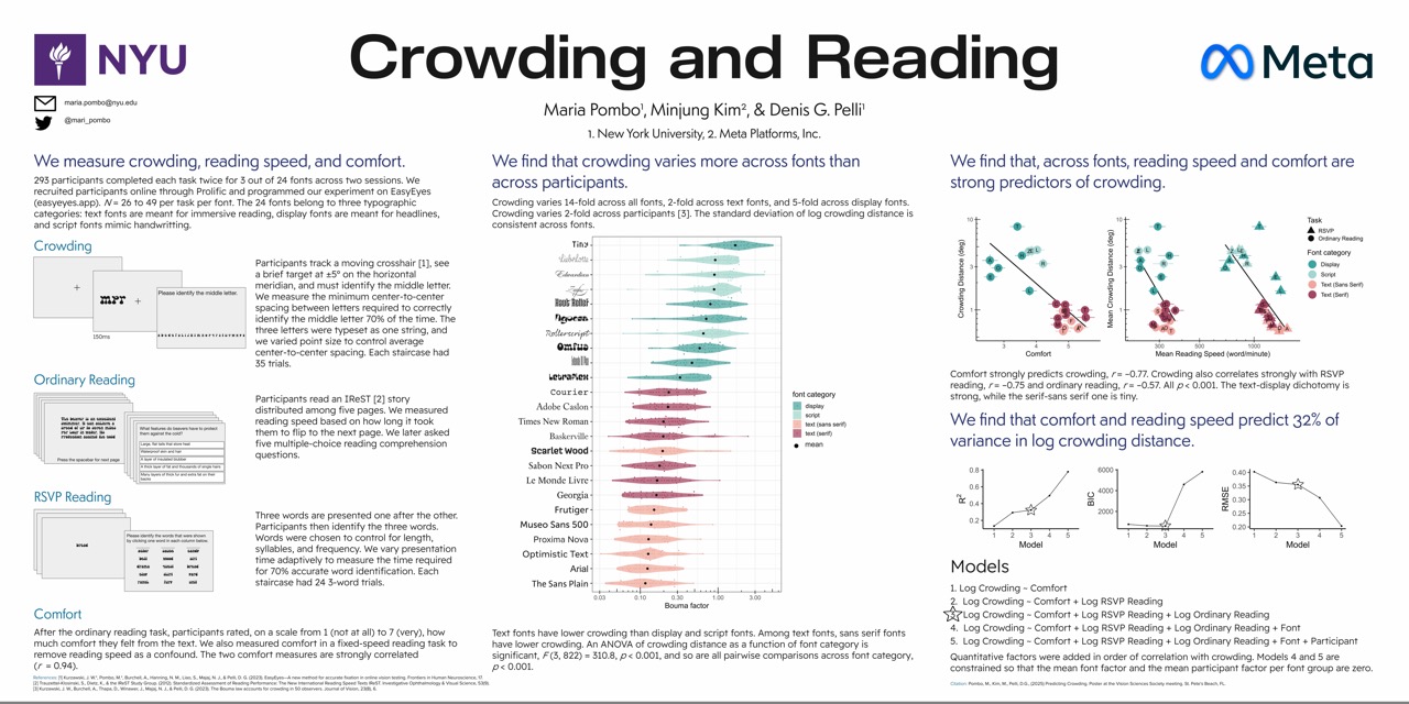
Crowding Predicts Reading Speed and Comfort Across Fonts and Participants
Maria Pombo, Minjung Kim, Denis G. Pelli
Abstract
Click to enlarge
Crowding and reading speed vary more than two-fold across participants and also vary across fonts. Here, we try many fonts and examine crowding and reading speed. Seventy-four online participants performed three objective tasks — visual crowding, ordinary reading, RSVP reading — and two subjective rating tasks — comfort and beauty. Each participant did these for 3 of 12 fonts. Fonts ranged from common text fonts (e.g., Times New Roman) to display fonts (e.g., Zapfino, an intricate script font, and Omfug, a bubbly, graffiti-like font). In the crowding task, participants identified the middle of three letters presented at ±5º horizontal eccentricity. QUEST measured the threshold spacing. In the ordinary reading task, participants read from a short story and answered reading retention questions. For RSVP, on each trial, 3 words were presented, one at a time. Participants then identified the three words among foils. QUEST measured the threshold word duration. Participants also rated (on a 7-point scale) their comfort after a fixed-rate RSVP reading task. Lastly, to assess the beauty of the font, participants rated how much beauty they felt from looking at a page of Latin Lorem Ipsum text. This emphasizes looking without language processing. Results reveal strong correlations between crowding and both reading comfort (r = –0.93) and speed (r = –0.89 for RSVP, r = –0.58 for ordinary reading). A mixed-effects linear model with font as a fixed effect and participant as a random effect explains the variance in log crowding distance (89%), log reading speed (84%), and log comfort (43%). Text fonts generally produce low crowding and faster, more comfortable reading, while display fonts with high crowding and slower reading are better suited for titles and ads. In sum, measuring a person’s crowding online predicts their reading performance and comfort across fonts.
https://doi.org/10.1167/jov.25.9.1773
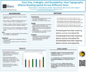
Font Size, X-Height, and Readability: How Typography Affects Reading Speed Across Different Sizes
Ben D. Sawyer, Md Manumur Rashid, Hilary Palmén, Mert Küçük, Nilsu Atilgan
Abstract
Click to enlarge
The relationship between print size and reading speed is well-established, with larger sizes resulting in larger image on the retina. This benefits populations such as older adults and individuals with visual impairments (Legge et al., 1985). However, in reading research, “size” is sometimes discussed in terms of x-height, which refers to the height of lowercase letters in a font. Importantly, x-height and print size are distinct; different fonts can have varying x-heights even at the same nominal size, potentially influencing readability. To investigate this distinction, we examined the combined effects of print size and x-height on reading speed. Participants (N = 60) read passages at varying sizes and x-heights, followed by comprehension questions. A repeated-measures ANOVA revealed that, as expected, print size significantly impacted reading speed (p < .05), while x-height alone did not (p = .134). To explore the relationship further and account for individual variability, we conducted a linear mixed-effects model analysis. This deeper analysis revealed an interaction between size and x-height. Specifically, when print size was small, participants read marginally faster with larger x-heights (mean = 248 WPM) compared to smaller x-heights (mean = 232 WPM). This effect was not observed at larger print sizes. These findings confirm that print size is a critical factor in reading speed across all conditions. Additionally, x-height plays a role in enhancing readability when print size is small and reading becomes more challenging. This insight is particularly relevant in scenarios where increasing print size is not feasible; selecting fonts with larger x-heights may offer an alternative strategy to improve readability.
https://doi.org/10.1167/jov.25.9.2645
Psychophysics of Variable Fonts: Do Multiple Font Features Interact to Impact Readability?
Silvia Guidi, Anna Kosovicheva, Benjamin Wolfe
Abstract
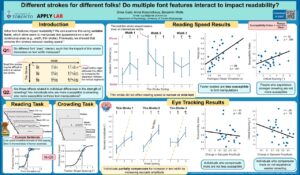
Click to enlarge
When choosing a font, we have some intuitive understanding of why a particular font may feel easier to read, but what elements of a font actually affect readability? To answer this question, we used variable fonts, in which every element, such as the width or stroke contrast of each letter, can be adjusted on a continuous axis. Previously, we have shown that changes within a single axis can change saccade amplitude and reading duration thresholds (Guidi et al., VSS2024). In a new study, we examined how these axes impact readability in combination by manipulating text appearance on two axes, thin stroke and width, at three levels per axis across the full range, for a total of 9 conditions. Participants read a series of sentences in each font condition while gaze position was tracked, classifying each sentence as true or false. Sentence presentation duration was staircased and we calculated duration thresholds needed for 80% classification accuracy for each condition. Thicker thin strokes decreased duration thresholds across all width settings, while the thinnest thin strokes resulted in the highest duration thresholds (i.e., the slowest reading performance). These extreme thin strokes impacted reading speed regardless of the width of the text. Eye tracking data revealed that participants partially compensated for increased text width by increasing their saccade amplitudes. By understanding how different font elements interact with each other, we may be able to understand what parts of text presentation affect readability the most, which can then be used to help maximize reading efficiency.
https://doi.org/10.1167/jov.25.9.2451
The Impact of Font on Typo Detection: A Novel Visual Search Paradigm
Emily Heffernan, Benjamin Wolfe, Anna Kosovicheva
Abstract
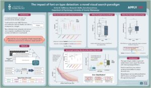
Click to enlarge
In visual search tasks, we scan our environment to identify a target (e.g., looking for your suitcase at the Tampa airport baggage claim). A better understanding of the factors that lead to success and failure in visual search requires a task that mimics our lived experiences but permits a high degree of experimental control. Here, we developed a novel typo detection paradigm to uncover how attentional processes interact with visual properties of stimuli in a word-based visual search task. Participants (N=9) scanned pseudo-paragraphs comprised of random 5-, 6-, and 7-letter words to find typos (i.e., incorrectly spelled words), which were present on 50% of trials. Five types of typos were included: transpositions (two letters swapped), insertions (a letter added to a word), deletions (a letter removed from a word), repetitions (a letter repeated), and substitutions (a letter replaced with another letter). In addition, half of the trials were presented in an “easy-to-read” font (Arial) and half were presented in a “hard-to-read” font (a version of Roboto Flex with narrow width and a high stroke contrast). Font had a main effect on reaction time: participants responded more slowly when the stimuli were presented in the hard-to-read font. Font had no overall impact on accuracy. However, participants were worst at identifying transposition errors, and for these trials, font did have a significant effect, such that performance was lower for the hard- versus easy-to-read font. These findings also highlight substantial individual differences in performance and sensitivity to font manipulation. Taken together, these results indicate that the appearance of text does impact visual search for typos, but only for specific types of errors. This paradigm can elucidate how constraints in peripheral vision (e.g., crowding) impact visual search performance for text-based stimuli.
https://doi.org/10.1167/jov.25.9.1931
The Impact of Font Weight on Expressiveness Beyond Latin: Insights from Arabic and English
Nilsu Atilgan, Hilary Palmén, Mert Küçük, Ben D. Sawyer
Abstract
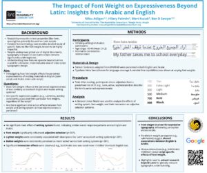
Click to enlarge
The influence of text properties like character spacing and font on readability has been extensively studied in Western languages using Latin scripts (Beier et al., 2022). Recent advancements in variable font technology now allow investigations into specific font features, such as weight, a highly impactful axis in typography (Dobres et al., 2016). Despite the global use of digital documents, non-Latin scripts remain underexplored. To address this gap, we examined how font weight affects the perceived expressiveness of reading materials in English and Arabic. Using Noto Sans, a typeface with extensive language coverage, 50 bilingual participants read sentences adapted from MNREAD (Mansfield et al., 1993) in both languages. After reading, participants selected adjectives from a list of 21 descriptors (e.g., loud, playful, calm, active, sophisticated) to describe the font. Noto Sans was presented at varying weights to examine the impact of font weight and writing system on adjective selection. A general linear model analysis revealed no significant main effect of the writing system (p = .139), indicating similar emotional responses across languages. Font weight significantly influenced adjective selection (p < .001). Lighter weights were associated with calmness (p < .001), while bolder weights were perceived as more active (p < .001) in both writing systems. Notably, an interaction effect was observed for certain expressions; for instance, bold Arabic text was rated as more childlike, a pattern not found in English. In conclusion, when designing typefaces or selecting fonts for digital materials, font weight can be a powerful tool to convey specific messages. Our findings reveal parallels between English and Arabic scripts in how weight influences expressiveness, while also highlighting unique interactions. This exploratory study emphasizes the need for the reading research community to investigate the impact of typefaces beyond the Latin alphabet, fostering a broader understanding of cross-script typographic design.
https://doi.org/10.1167/jov.25.9.2622
Typography and Pupilometry: Exploring the Speed, Comprehension, and Concentration Trade-Off in Reading
Borano Llana, Alisa Baron, Kushas Khadka, Yusra Suhail, Shaun Wallace
Abstract
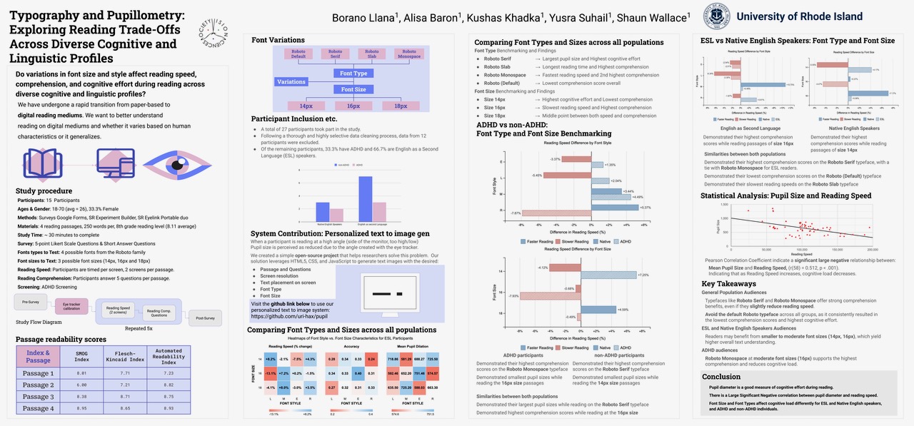
Click to enlarge
Readers constantly balance their ability to read and comprehend vast amounts of information quickly while maintaining concentration over time. Our in-lab study investigates the correlation between these variables using eye trackers and pupillometry, replicating results from our remote readability studies. Recent research shows that increased pupil size and dilation indicate higher concentration. Participants read passages in four versions of Roboto (regular, slab, monotype, and serif) in three sizes (14px, 16px, and 18px). They read one passage and answered five comprehension questions per text design. To measure reading speed, we split each passage into two screens. Our preliminary results feature three participants; we aim to recruit a mix of adult readers with and without ESL and ADHD to discover new relationships between these diverse participants and our variables. Our preliminary findings reveal positive relationships between all variables: reading speed, comprehension, and pupil size across all text designs. Reading speed and mean pupil size per screen were moderately correlated (r(22) = 0.47, p < .03). We found moderate correlations and borderline significant effects for reading comprehension and mean pupil size (r(10) = 0.56, p = .058); and reading comprehension and reading speed, (r(10) = .561, p = .058). We found no relationship between font size and pupil size, indicating initially that small manipulations in size might not affect concentration. We also found no relationship between the font style variations within a typeface and concentration. Thus, pupil size and reading performance might remain stable across everyday font variations and size manipulations. Adding to our prior remote readability studies, participants’ pupil size decreased on average 14% throughout the study. Their pupil size also decreased 83% of the time during the second screen per text design. Our research suggests that the reader’s concentration is essential to aid future personalization of text designs across populations.
https://doi.org/10.1167/jov.25.9.247
![]() About the Vision Sciences Society: The Vision Sciences Society is a nonprofit membership organization of scientists who are interested in the functional aspects of vision. VSS was founded in 2001 with the main purpose of holding an annual meeting that brings together in one forum scientists from the broad range of disciplines that contribute to vision science, including visual psychophysics, neuroscience, computational vision and cognitive psychology. The scientific content of the meetings reflects the breadth of topics in modern vision science, from visual coding to perception, recognition and the visual control of action, as well as the recent development of new methodologies from cognitive psychology, computer vision and neuroimaging.
About the Vision Sciences Society: The Vision Sciences Society is a nonprofit membership organization of scientists who are interested in the functional aspects of vision. VSS was founded in 2001 with the main purpose of holding an annual meeting that brings together in one forum scientists from the broad range of disciplines that contribute to vision science, including visual psychophysics, neuroscience, computational vision and cognitive psychology. The scientific content of the meetings reflects the breadth of topics in modern vision science, from visual coding to perception, recognition and the visual control of action, as well as the recent development of new methodologies from cognitive psychology, computer vision and neuroimaging.