Classroom Evidence: Typography Impacts Reading Fluency for Strong and Struggling Readers
Much more than a simple design choice, Typography directly impacts how well individuals read. Research demonstrates that adjusting text size, shape, and spacing can enhance reading performance for struggling and dyslexic readers. However, the anecdotal evidence suggested a much broader impact. (See Henry’s Story and Claire’s Story.)
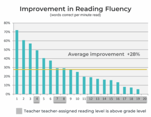
In a 2015 study of a third-grade public school classroom, 95% of students improved their reading fluency with a simple change to the text format. Across the classroom, an average gain of 28% in words correct per minute was recorded when students transitioned from a standard textbook format to one that better suited their needs. Some students who were already reading above grade level achieved above-average gains using an alternative text format. The students had different best formats; none of the formats tested was the best for all proficient students, or all less proficient students.
The study highlighted two key points:
No single text format works best for all readers.
Even strong readers can benefit from typographic adjustments.
With the digital platforms available today in educational settings, small but powerful changes to text format are possible. Personalized text to support each reader’s optimal reading experience and performance can be delivered at scale.
A 2015 classroom study investigated whether variations in text format could improve reading fluency in typical third-grade students. Previous research has shown that typographic adjustments (changes to font size, character spacing and width, and line spacing) can positively influence reading performance, particularly for students with dyslexia or other reading challenges.
This study explored whether such benefits could extend beyond those who struggle with reading to proficient readers. Varying font, size, character spacing a character width, five text formats were evaluated.
Participants. Twenty third-grade students from a public elementary school participated in the study. Reading group levels were provided by the classroom teacher. Data collection occurred in the spring semester, near the end of the academic year. All students advanced to fourth grade the following fall.
Materials. The reading passage was Stone Soup (Macmillan/McGraw-Hill; Lexile level 560), a standard end-of-year selection for this grade level. Five similar sections were used for testing. The story was chosen to provide an appropriate challenge and minimize the likelihood of prior familiarity.
Text Formats. Consistent with the reading textbook used in the classroom, the control condition was the Times New Roman font presented at a 16-point size. Four experimental text format conditions were created using the font Avant Garde Bk BT and varied by point size, character spacing (“spacing”), and character width (“width”). The line spacing was set to double (2.0) and margins to one inch for all conditions.
| Font | Size | Additional Character Spacing |
Character Width |
|---|---|---|---|
| Times New Roman (TNR) | 16 | 0 | 100% |
| Avant Garde (AG) | 16 | 0 | 100% |
| Avant Garde + Char Space (AG+) | 16 | 2.5 pts | 100% |
| Avant Garde + Size + Char Space (AG++) | 18 | 3.5 pts | 100% |
| Avant Garde + Size + Char Space + Width (AG+++) | 18 | 3.5 pts | 125% |
Testing Process. Students read each passage aloud to a trained reading volunteer. The volunteer used Running Record scoring to document reading accuracy and errors and recorded the completion time for each section. Reading fluency was measured in words correct per minute (WCPM), a standard metric combining accuracy and reading rate. The same volunteer administered all testing sessions to maintain consistency across students and conditions. To minimize order effects, the presentation order of the five text format conditions was counterbalanced.
Nineteen of the twenty students (95%) demonstrated improved reading fluency in at least one experimental text format. For each student, the best format was identified as the condition that produced the highest words correct per minute (WCPM). Improvement was then calculated as the percentage difference between each student’s best-performing format and their performance in the control condition (Times New Roman). (Example: If a student read 100 WCPM in the control and 128 WCPM in their best format, the improvement was calculated as ((128 – 100) ÷ 100 = 28%).
Consistent with previous research, there was no one best format for all readers.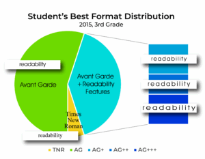
Average fluency improvement across the group was +28% WCPM. Many of the largest gains recorded were made by less-proficient readers. However, some of the students identified by the classroom teacher as reading above grade level demonstrated gains in fluency exceeding the average improvements of their peers. (See students 4, 7 and 8.)
These findings suggest that typography influences reading fluency for a broad range of students, not only those who struggle. Small adjustments in text format can produce measurable differences in reading fluency, even among students already performing above grade level. Importantly, no single format supported all students equally well, underscoring the need for personalized reading formats.
The proliferation of digital reading and learning platforms can provide scalable solutions for delivering personalized reading experiences to diverse learners.
© 2018, 2025 Readability Matters, All rights reserved.