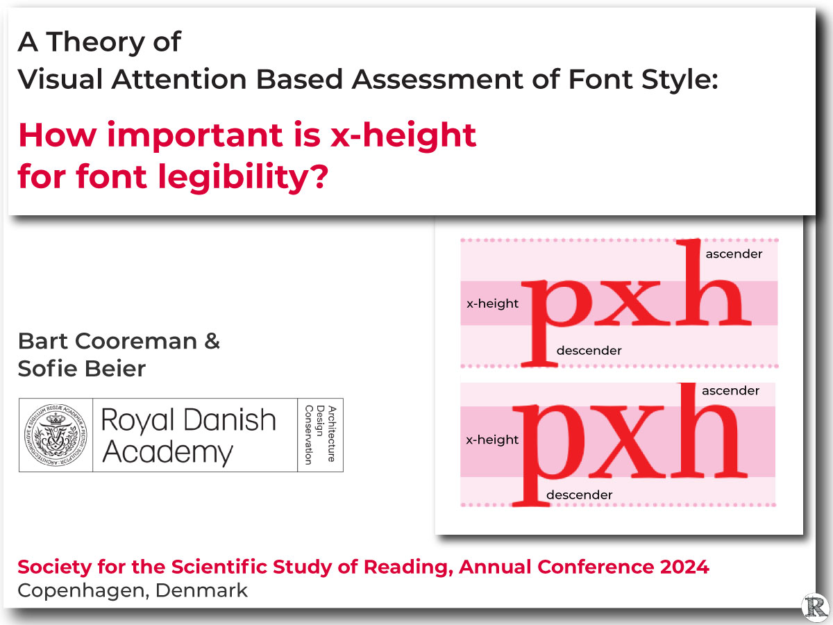
A Theory of Visual Attention Based Assessment of Font Style: How Important is x-height for Font Legibility?
At the Society for the Scientific Study of Reading (SSSR) annual conference, Drs. Bart Cooreman and Sofie Beier presented their work to understand the impact of different font characteristics on reading letters. In three experiments, they looked at the x-height of letters (the height of the main body of lowercase letters in a typeface, specifically the height of the lowercase “x”) and the length of ascenders and desenders (the parts of lowercase letters that extend above and below the x-height). 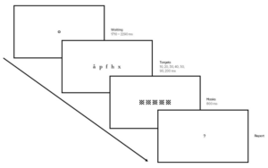
 They aimed to understand how these features affect letter recognition and recall.
A key goal of the study was to focus on x-height as a separate variable to understand better its role in how easy a font is to read. The researchers used a test where participants were shown letters briefly and asked to recall as many as possible. They then applied the Theory of Visual Attention (TVA) to model how quickly participants processed the letters, how much information they could retain in their short-term memory, and how font features impacted their perceptual thresholds.
The study found that letters with asenders or descenders, like ‘b’ or ‘p’, were recognized more easily than those without. Making the parts that extend above or below the x-height longer improved recognition, but only for about half of the letters. Increasing the overall x-height of the letters positively affected recognition for all letters. When both changes were combined, the increase in x-height had the most significant impact, speeding up how quickly participants processed the text.
Implications for Enhancing Readability and User Experience
While the study focuses on letter recognition and recall, the findings likely extend to improving word readability. Legibility plays a crucial role in reading; small changes in font characteristics—such as x-height and ascender/descender length, as studied in this case—can significantly improve how easily text is read and understood. The authors note that this is crucial in time-sensitive contexts like traffic signs and vehicle displays or for readers with conditions affecting processing speed.
By integrating these insights, typographers and UX designers can create more efficient, user-friendly digital experiences. Design choices as simple as choosing a font with a greater x-height can improve the reader’s experience. Even better is to provide users with control over text display (including the ability to change font, character or line spacing, and more), supporting diverse reading preferences and needs. Text format modification can improve the overall reading performance for readers, regardless of age and reading ability.
A Theory of Visual Attention Based Assessment of Font Style: How important is x-height for font legibility?
Cooreman, B. & Beier, S
Institute of Visual Design, Centre for Visibility Design, Royal Danish Academy – Architecture, Design, Conservation
Abstract
Purpose: We examined the importance of a font’s x-height for letter recognition. The height of the lowercase letter ‘x’, dictates the height of letters like ‘acemnorsuvwz’ and the bowl of letters like ‘bpqd’. Within typography, the ‘x-height’ is often considered to be the defining factor of the perceived font size, and consequently, its legibility. Within the reading literature, such detailed font style variables are often considered to be less important. In either case, rigorous study is lacking.
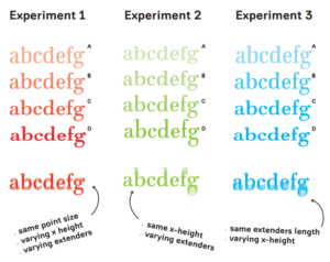
Method: In three experiments (n=26, n=12, n=12), we assessed x-height fraction, absolute x-height, and ascender/descender length impact on a whole-report paradigm. The Theory of Visual Attention (TVA) modeled participants’ perceptual thresholds, processing speed, and Visual Short-Term Memory capacity.
Results: Letters with ascenders/descenders are recognized correctly more often than letters without ascenders/descenders. Increasing a fonts’ ascenders/descenders length significantly improved letter recognition, but this positive effect was limited to only half the letters in the alphabet. Increasing the fonts’ x-height improved letter recognition, and this effect applied to all letters in the alphabet. When both effects co-occur (i.e., in a font’s x-height fraction), the latter effect was dominant, and yielded a positive effect on the participants processing speed in favor of fonts with larger x-height fractions.
Conclusion: Our study confirms the significance of a font’s x-height for legibility. To enhance legibility, typographers can modify x-height fraction or ascender/descender length. Considering processing speed, focus on x-height fraction is crucial in time-sensitive contexts like traffic signs, vehicle displays, or for readers with conditions affecting processing speed.
Citation for published version (APA): Cooreman, B., & Beier, S. (2024). A Theory of Visual Attention Based Assessment of Font Style: How important is x-height for font legibility?. Poster session presented at Society for the Scientific Study of Reading: Annual Conference, Copenhagen, Denmark.
Get the Abstract and the Poster:
See the Overview Presented at ATypI:
![]()