New Research Published from Across the Readability Community
The proceedings of the 2024 Vision Sciences Society (VSS) conference include four posters presented by members of the cross-disciplinary readability research community. Their groundbreaking work examines how different typefaces and typographic features influence reading performance.
These presentations add to the growing evidence that typography plays a critical role in reader efficiency and effectiveness. Variations in digital text formats significantly impact reading speed and comprehension, highlighting the need for further investigation across diverse age groups, abilities, and different types of reading tasks.
Additionally, The Readability Consortium and the growing Readability Research Community are focused on transparent and replicable research. To support this goal, TRC has developed a readability tool for conducting online readability studies. The platform promises to accelerate and encourage new research by facilitating large-scale testing. New tools are required to provide insights about optimal reading formats and encourage further exploration at the intersections of typography, cognitive psychology, and digital user experience.
![]()
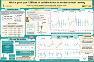
What’s your type? Effects of variable fonts on sentence-level reading
Silvia Guidi, Zainab Haseeb, Anna Kosovicheva, Benjamin Wolfe
Department of Psychology, University of Toronto Mississauga
Researchers from the APPLY Lab look at how different visual aspects of digital text (thin stroke, thick stroke, width, weight, and slant) impact reading efficiency. Participants were asked to evaluate a collection of online sentences and decide if they were true or false. The researchers used variable fonts to generate five font styles based on five font axes in presenting the material. This allowed them to evaluate how different font features influenced reading performance. The researchers also tracked the participants’ eye movements to better understand the impact of font variations on reading efficiency.
The data indicated that readers’ eye movements adjusted with varying font parameters, suggesting individuals naturally vary their reading strategies when presented with text formats that are better or worse for them. Personalized text settings create the opportunity to make reading more comfortable and improve performance, helping individuals read more quickly and easily. The poster provides more detailed results on each font variation axis.
Read the full abstract: https://jov.arvojournals.org/article.aspx?articleid=2802049
See the poster: https://applylab.org/assets/pdf/posters/Guidi_VSS_Poster_2024.pdf
![]()
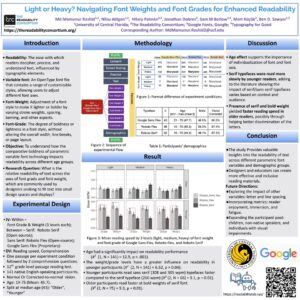
Light or Heavy? Navigating Font Weights and Font Grades for Enhanced Readability
Md Mamunur Rashid1,2, Nilsu Atilgan1,2, Hilary Palmén2,3, Jonathan Dobres2, Sam M Berlow2,4, Mert Küçük2, Ben D. Sawyer1,2
1University of Central Florida; 2The Readability Consortium; 3Google Fonts, Google; 4Typography for Good
This work investigates the Influence of font weight and grade on readability across different age groups, examining how varying font characteristics impact reading speed and comprehension among participants aged 19 to 75. Key findings indicate that younger readers read sans serif fonts faster, while older readers read faster with bold serif fonts. The results highlight the importance of individualized font selection for optimizing readability across age demographics.
The study Provides valuable insights into the readability of text across different parametric font variables and demographic groups. The poster discusses the importance of individualization of font parameters and suggests that designers and educators can create more effective and inclusive reading materials. They note that future research should study diverse populations, examine other typographic variables such as spacing, and incorporate additional metrics such as reader enjoyment, immersion, and fatigue.
Read the full abstract: https://jov.arvojournals.org/article.aspx?articleid=2802041
See the poster: https://thereadabilityconsortium.org/wp-content/uploads/2024/08/font-weights-grades-MMR44x44.pdf
![]()
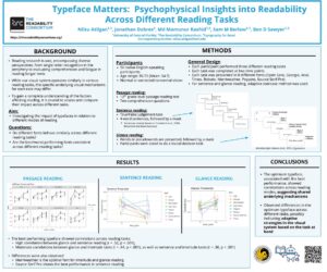
Typeface Matters: Psychophysical Insights into Readability Across Different Reading Tasks
Nilsu Atilgan1,2, Jonathan Dobres2, Md Mamunur Rashid1,2, Sam M Berlow2,3, Ben D Sawyer1,2
1University of Central Florida; 2The Readability Consortium; 3Typography for Good
This study explores the impact of typefaces on reading performance across various tasks, including sentence reading, passage comprehension, and glance-based lexical decision tasks. Fifty participants were tested using eight fonts, measuring their reading speed, reaction time, and accuracy. The study found that optimal typefaces vary by task, though performance was correlated across tasks.
The findings revealed that while some fonts, like Merriweather, performed consistently well in tasks such as glance reading, others, such as Source Serif Pro, were optimal for sentence reading. The authors note, “Current findings suggest that the complex processes of reading may lead to the development of diverse reading strategies, with external factors potentially influencing the process variably. This suggests that individuals’ preferences for optimal reading parameters, especially fonts in this study, may vary depending on the task, despite correlations.”
Read the full abstract: https://jov.arvojournals.org/article.aspx?articleid=2801870
See the poster: https://thereadabilityconsortium.org/wp-content/uploads/2024/08/typeface-matters-NA42x35.pdf
![]()
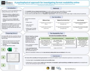
A Psychophysical Approach For Investigating Format Readability Online
Kurtuluş Mert Küçük3, Md Mamunur Rashid4, Anna Kosovicheva1,2, Veronica Penkova5, Amy Giroux5, Nilsu Atilgan5, Shaun Wallace6, Sam Berlow5, Stephanie Day5, Ben D. Sawyer5
1University of Toronto Mississauga, 2APPLY LAB, 3Boğaziçi Üniversitesi, 4University of Texas at San Antonio, 5The Readability Consortium, 6The University of Rhode Island
The poster introduced a scientific tool for online reading performance studies, enabling researchers to manipulate text parameters like typeface, font weight, and letter spacing to assess optimal reading formats. Built using psychophysical principles and tested via Pavlovia and PsychoPy, the tool allows large-scale testing while minimizing environmental noise. It primarily focuses on paragraph reading but can be adapted for tasks like single-word recognition. Presenting text stimuli as .jpg images avoids compatibility issues across different systems. The poster also showcases a pilot study demonstrating the tool’s settings and how counterbalancing functions.
The future of the readability research tool holds great potential, facilitating both academic research and practical applications in various fields. It aims to accelerate readability research at the intersections of typography, cognitive psychology, and digital user experience by reducing research costs and simplifying the experimental setup.
Read the full abstract: https://jov.arvojournals.org/article.aspx?articleid=2802051
See the poster: https://thereadabilityconsortium.org/wp-content/uploads/2024/08/psychophysical-approach-MK44x35.pdf
Learn more about the Readability Tool: https://readabilitylab.xyz or contact [email protected]
![]()
 About the Vision Sciences Society: The Vision Sciences Society is a nonprofit membership organization of scientists who are interested in the functional aspects of vision. VSS was founded in 2001 with the main purpose of holding an annual meeting that brings together in one forum scientists from the broad range of disciplines that contribute to vision science, including visual psychophysics, neuroscience, computational vision and cognitive psychology. The scientific content of the meetings reflects the breadth of topics in modern vision science, from visual coding to perception, recognition and the visual control of action, as well as the recent development of new methodologies from cognitive psychology, computer vision and neuroimaging.

