US Secretary of State, Antony Blinken Requires Readability Changes
Personalization matters. One-format-fits-all should no longer be the defacto model of text presentation. Research supports the personalization of text format to improve reading speed, accuracy and comprehension for most of the population, not only as an accessibility solution.
Readability Matters was excited to see the State Department’s recognition that text formats are important. The widely reported topic is a move toward giving better readability the attention it deserves. Let’s expand the conversation!
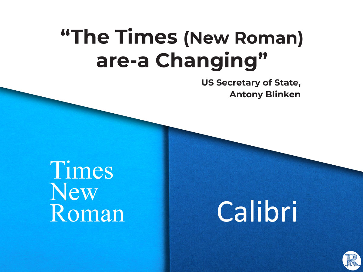
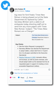
In a widely reported message to all US embassies, Secretary Antony Blinken directed staff not to send any more papers using the Times New Roman typeface. Instead, he directed domestic offices, bureaus, and posts overseas to adopt Calibri in a 14-point size to create better reading. Secretary Blinken positions the change as one supporting greater accessibility of the documents.
John Hudson, State Department Correspondent for the Washington Post, with Annabelle Timsit, reported the shift citing experts. Jack Llewellyn, a London-based designer specializing in typography, notes that there is no one-size-fits-all solution. Ian Hosking, a senior research associate at the Engineering Design Center at the University of Cambridge, remarked that design factors other than font and size–such as text alignment, spacing and contrast in color– make a difference. Hosking also advocates for personalization.
“Bigger fonts can help those with visual impairments, but he said a better solution would be to ensure people have the option to adjust them to suit their own needs.”
– David Berman, the principal of David Berman Communications

Reporter Daniel Victor of the New York Times details the debate that has taken place over typefaces that use serifs (small lines or strokes attached to the larger stroke in a character or symbol, as in Times New Roman). “Several experts said the research now leans strongly toward the conclusion that sans serif fonts are more readable, but there is a decades-long history of disagreement.”
Victor cites communications expert David Berman, who notes that a better solution would be to ensure people have the option to adjust [fonts] to suit their own needs.
Is this the right debate?
We don’t think so! The question is not ‘Times New Roman or Calibri?’ nor is it ‘serif or sans-serif font?’ The only question that makes sense in light of recent research is whether it should be one-format-fits-all or personalized text. Technology makes personalization possible; for example, a PDF document can be personalized with Adobe Reader Liquid Mode.
Personalization matters. One-format-fits-all should no longer be the defacto model of text presentation.
Learn more about the growing community working to bring better reading to the world. See the Wiki describing the work of The Readability Consortium, Adobe, Google, the University of Central Florida, and more. Together they are developing research-informed solutions to make each reader the best reader they can be.
Read More
Washington Post
A font feud brews after State Dept. picks Calibri over Times New Roman
New York Times
Citing Accessibility, State Department Ditches Times New Roman for Calibri
Politico
Who shot the serif?
The Verge
The State Department wants memos written in Calibri now, not Times New Roman
Wired
The US State Department Ditches Times New Roman for Calibri


