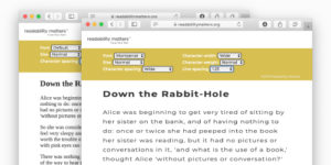
Adjust Readability Features to Improve Your Reading Outcomes
Many different audio signals can be adjusted for a better sound experience. In the same way, visual components of digital text format can be adjusted to create a better reading experience. Technology offers new opportunities for you as an individual to Tune Your Text. Adjust readability features to improve your reading outcomes.
Tune Your Text
Readability Features control character size, shape, and spacing. Historically, fonts have been used to address reader preference for different character shapes, stroke weights, and inter-character spacing. Using a selection of fonts with additional reader controls for these adjustments delivers more benefits for the reader. Additionally, control of text size, line spacing, and background color also provides significant advantages. The text format that makes you the best reader is at the intersection of these Readability Feature settings.
There is no single best font or text format for all readers; personalization is required.
Readability Matters
The Readability Sandbox
Play in the Readability Sandbox. Experiment with readability features that may improve your reading experience. Change base font, text size, character and line spacing, character width, and more. Try it now.
Ask reading application providers and publishers to give you access to Readability Features, so you can Tune Your Text to enjoy reading more, and to get more done.


