Studying Format Readability in Children
Dr. Stephanie Day and team conducted a study that provides important insights into how text format readability changes (in this case, font and letter spacing variations) impact reading performance in readers in grades 3–5. The results showed that changes to text format significantly improved reading speed at both the group and individual levels without negatively impacting reading comprehension. Notably, no specific format proved the best or least effective for every child. This work highlights the need for personalized formatting rather than a one-format-fits-all approach.
“Advances in educational technology development for K-12 classrooms mean that children are reading on digital displays more than ever before, but improved format readability of digital text has been mostly overlooked as a feature that can support learning, and format readability research with children lags promising research with adult populations.”
Day et al.
The authors “ground [their] conceptual theory in the Simple View of Reading (SVR), which posits that there are two major components to successful reading comprehension: the product of word recognition—decoding and fluency (reading speed)—and language/ listening comprehension—comprised of vocabulary, oral language, comprehension monitoring, and background knowledge.” Day et al. note that text format readability influences word recognition, a critical factor in reading comprehension.
 Early format readability research with adults and children shows significant gains in reading speed when reading in optimal formats, which are a ‘fit’ for the individual, as compared to formats that are least optimal or a ‘clash’ (Beier et al. 2022, Wallace et al. 2019). Students were tested using common fonts in PDFs, newsprint, and the web. Serif and san-serif fonts used on digital platforms across different types of devices were selected. The students were tested using an online platform, using silent reading followed by comprehension questions.
Results

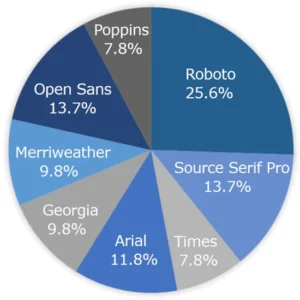
Day et al.: Font fit (highest WPM) at the individual child level. No one font was found to be the best-fitting font for individual students. Click to enlarge.
Although Roboto was the fastest font on the group level and the fastest font at the individual child level, no one font was associated with being students’ best-fitting font or students’ font clash. Both Arial and Roboto significantly affected students’ reading speed, and both fonts had higher mean WPMs across the sample. The average WPM difference between students’ best-fitting font and their font clash was 101 words per minute.
Researchers did not observe an effect of spacing on reading speed at the group level. However, when looking at individual student results, they found students had significant gains in reading speed with spacing adjustments. They observed, “Presently spacing is provided at the same value to all students in a classroom, but these data suggest that the majority of students might benefit from more, or less, spacing.”
The authors call for more research to better understand the specific aspects of font, spacing, and other typographical features that may have the most significant impact on reading performance. Further, they observe that the individuation of format readability features is simple to implement in the digital medium, making it an inexpensive intervention compared to the individuation of content readability. Their research has important implications for building more supportive educational technology platforms for students and improving reading outcomes.
The Influence of Format Readability on Children’s Reading Speed and Comprehension
Stephanie L. Day, Nilsu Atilgan, Amy E. Giroux and Ben D. Sawyer
Education Sciences, 7 August 2024
Abstract
Background: Format readability, including font and spacing, impacts reading metrics in adults, but will the research generalize to children? We examined how eight fonts (four serif and four sans serif) and three-character spacing variations influenced children’s reading comprehension and reading speed. Methods: Fifty-one students in third-fifth grade read 11 narrative text passages on a computer and answered comprehension questions. Passages were randomized in terms of order. First, the font in which the text of each passage was presented was manipulated. Then passages were presented in three spacing manipulations (narrow, normal, and wide). Results: A linear mixed effects model demonstrated that, on a group-level, passages presented in Roboto and Arial font were read significantly faster (words-per-minute) than other fonts. On the individual level, students experienced significant boosts in reading speed (words-per-minute) between their best and worst fitting font, and spacing. A chi-square test showed no one font or spacing setting that was most likely to be a student’s font fit or clash. For reading comprehension, no speed–comprehension tradeoff was observed. Conclusions: Changes to text format at the group and individual level may yield boosts in reading speed for students, without negatively impacting reading comprehension.
Keywords: literacy; fluency; comprehension; information design; typography; elementary education; educational technology
Educ. Sci. 2024, 14(8), 854; https://doi.org/10.3390/educsci14080854
Read the full paper here: https://www.mdpi.com/2227-7102/14/8/854.
 About Education Sciences: From its first issue in 2011, Education Sciences has grown as a scholarly international open-access journal. Its aim remains to publish extended full-length research papers that have the scope to substantively address current issues in education. As a member of the Committee on Publication Ethics (COPE), their goal has been to disseminate high-quality research. Their publisher, MDPI, takes the responsibility to enforce a rigorous double-blind peer review together with strict ethical policies and standards to ensure to add high-quality scientific works to the field of scholarly publication.


