Small Font Changes can Make Significant Differences in Successfully Reading Digital Text
As more and more reading moves from print to digital surfaces, it is important to challenge typographic traditions established when most reading involved printed materials. There is little research about the impact of character width on letter recognition. Digital text is generally presented using fonts of regular letter width.
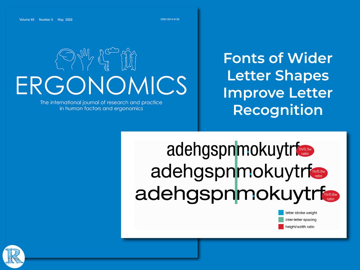
Drs. Chiron Oderkerk and Sofie Beier of the Centre for Visibility Design at the Royal Danish Academy designed a study to evaluate the impact of wider letters. They published their research, Fonts of Wider Letter Shapes Improve Letter Recognition in Parafovea and Periphery in the May 2022 issue of Ergonomics. (Ergonomics publishes scientific research to understand and improve human interactions with products, equipment, environments, and systems.)
Oderkerk and Beier sought to understand the effects of font width on letter recognition in the reader’s peripheral visual fields. Letter recognition in the visual periphery is essential in reading paragraphs of text.
The paper cited previous research that found greater inter-letter spacing minimizes the effect of crowding. Crowding not only exists between an object and its flankers but is also driven by the critical spacing of the parts of the letter itself. The researchers hypothesized that letter recognition would benefit from added letter width to expand the spacing within the letters themselves.
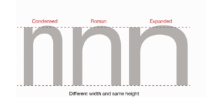
The authors tested three variants of the font family Helvetica Neue (Condensed, Standard, and Extended). The Helvetica font family is one of the world’s most commonly used fonts, both in advertising and publishing and in urban signage. Since all three test fonts originated from the same family, except for the variable of letter width, all have near identical letter features (vertical proportion, letter structure, letter boldness, and inter-letter spacing).
The in-lab study was conducted on a small number of adults. The participants completed two single-target trigram letter recognition experiments with the reading angle varied between the visual field parafovea and periphery.
The results demonstrated that wider letter shapes facilitate better recognition than narrower letter shapes and are consistent with their hypothesis.
Important for Readability Research
Insights into a relatively new body of research show that reading outcomes can be improved by personalizing the digital text format. To date, many readability research studies have compared multiple fonts. A significant challenge is to isolate the readability features, such as stroke weight and width, x-height, inter-letter spacing, and more. The goal is to understand which readability feature, or combination of features, impacts an individual’s reading outcomes.
Oderkerk and Beier’s research design allowed them to evaluate character width by comparing three fonts from the same font family. Additionally, their in-lab study controlled additional variables (e.g. monitor resolution and distance of the participant to the stimuli) that can impact results. The results demonstrated that width could impact letter recognition even with a small sample size.
These group-level results are promising; letters from wider fonts are more easily recognized than narrower fonts. These relatively small font format changes–within the norms of current typography design recommendations–can impact a reader’s ability to recognize letters.
Since individuals, young and old, have unique visual systems, additional research on more populations can evaluate the impact of readability features, in this case widened letters, for the individual reader. Understanding more about the impact of character width on individuals will help inform the design of digital text in various reading scenarios.
This study involved two single-target trigram letter recognition experiments. Adding this new research approach will bring more depth and insight into this growing cross-disciplinary field of readability research.
Read the Full Paper here.
Fonts of Wider Letter Shapes Improve Letter Recognition in Parafovea and Periphery
Chiron A. T. Oderkerk & Sofie Beier
ABSTRACT
Most text on modern electronic displays is set in fonts of regular letter width. Little is known about whether this is the optimal font width for letter recognition. We tested three variants of the font family Helvetica Neue (Condensed, Standard, and Extended). We ran two separate experiments at different distances and different retinal locations. In Experiment 1, the stimuli were presented in the parafovea at 2 eccentricity; in Experiment 2, the stimuli were presented in the periphery at 9 eccentricity. In both experiments, we employed a short-exposure single– report trigram paradigm in which a string of three letters was presented left or right off-centre. Participants were instructed to report the middle letter while maintaining fixation on the fixation cross. Wider fonts resulted in better recognition and fewer misreadings for neighbouring letters than narrower fonts, which demonstrated that wider letter shapes improve recognition at glance reading in the peripheral visual view.
PRACTIONER SUMMARY
Most of the text is set in fonts of regular letter width. In two single-target trigram letter recognition experiments, we showed that wider letter shapes facilitate better recognition than narrower letter shapes. This indicates that when letter identification is a priority, it is beneficial to choose fonts of wider letter shapes.
Oderkerk, C. A. T., & Beier, S. (2022). Fonts of wider letter shapes improve letter recognition in parafovea and periphery. Ergonomics, 65(5), 753–761. https://doi.org/10.1080/00140139.2021.1991001

About Dr. Chiron Oderkerk. Chiron Oderkerk is a postdoctoral researcher at the Royal Danish Academy at Centr for Visibility Design. Having done a Ph.D. in Psychology at the University of Copenhagen, his scientific research focuses on the mathematical modeling of visual attentional processes.

About Dr. Sofie Beier. Designer and Professor WSR Sofie Beier is head of the Centre for Visibility Design at the Royal Danish Academy. She is the author of the books Type Tricks: Your personal guide to type design and Reading Letters: designing for legibility and has published numerous academic papers on typeface legibility.
 About Ergonomics: The journal Ergonomics is an international refereed publication with a 60-year tradition of disseminating high-quality research. Original submissions, both theoretical and applied, are invited from across the subject, including physical, cognitive, organizational, and environmental ergonomics. Papers reporting research findings from cognate disciplines are also welcome, where these contribute to understanding equipment, tasks, jobs, systems, and environments and the corresponding needs, abilities, and limitations of people.
All published research articles in this journal have undergone rigorous peer review, based on initial editor screening and anonymous refereeing by independent expert referees.


