Readability Changes Impact Reading Performance
Readability Matters advocates for the provision of a full set of Readability Features (including font choice, size, character spacing, character expansion, and line spacing.) Previous Readability Matters research has demonstrated significant numbers of readers benefit from the simple change to a clean round font, such as AvantGarde. Font matters for these readers as well as for those who experience further performance gains by the use of additional Readability Features.
As Readability Features are added to digital reading platforms and products, providers should participate in rigorous research to determine which fonts to distribute. Fonts should not be limited to a single font or even to one serif and one sans serif font. Research must include reader populations with varied attributes so as not to influence the results. These should include readers of different age, educational level, and reading level. Additional considerations may include the reader’s current volume and format of reading.
The goal of this quick study was to identify freely available fonts that perform well. Readability Matters identified several from the collection of those distributed on popular devices or under an Open Font License, that might perform well based on previous experience with AvantGarde.
A Readability Matters White Paper
Analyzing the Immediate Effect of Base Font on Reading Performance
Small-Scale Directional Study
Kathy Crowley and Marjorie Jordan
June 2019
This report summarizes the findings of a May 2019 small-scale study of the impact of selected base fonts on individual reading performance, measured through reading fluency[1]. Research correlates increased reading fluency to improved comprehension[2].
Previous studies have proven that small modifications in Readability Features (size, character spacing and width, and line spacing) have an immediate impact on reading performance. This study varies only font to understand the effect of base font alone.
Design
Students: Teacher selected ten third grade students with identified fluency issues independent of the student’s reading level. All students will advance to fourth grade in August 2019. One student’s score was eliminated due to a timing interruption.
Testing Material: The participants read five sections from start to finish of Macmillan/McGraw-Hill “Stone Soup” (Lexile[3] = 560). Stone Soup is part of the standard end-of-the-year reading materials. The reading materials were selected to be challenging for the student population, given the average reading level. The objective was to ensure that the text presentation was being measured, not reading competency. The students did not previously read by this story.
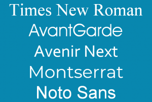
 The material was divided into five equal sections. Each section was formatted with a different font, all formatted in size 16. The control font was Times New Roman; four additional fonts were tested: AvantGarde, Avenir Next, Montserrat and Noto Sans. The font order was varied.
AvantGarde was selected for comparison to previous Readability Matters’ studies. Avenir Next is commonly used on devices running Apple’s iOS. Noto Sans is commonly used on devices running Google’s Android operating system. Montserrat is a free Google Font, (OFL license.)
Testing Process: The teacher listened to the student read, completed Running Record[4] scoring, and documented completion times of each section. Teacher testing provided an independent assessment and reduced testing anxiety for the students.
Results
Results compared the traditional Times New Roman size 16 font (control) to the four other fonts (variable).
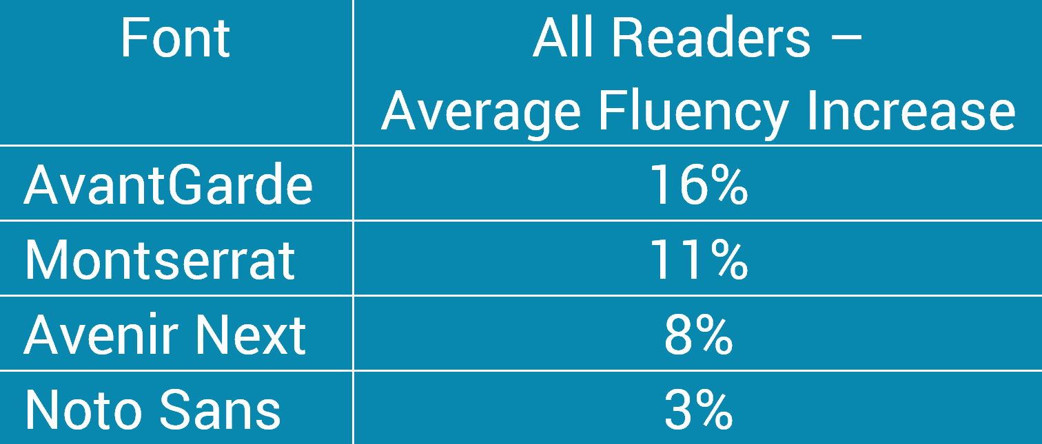
First, the results were analyzed across all sections read. A significant impact was demonstrated by altering the base font. The following difference was seen in the average increase achieved in aggregate for each base font.

Second, each reader’s best-read passage was compared to the control passage. The average fluency improvement recorded for each base font, and the number of students with the base font as their best format follows.

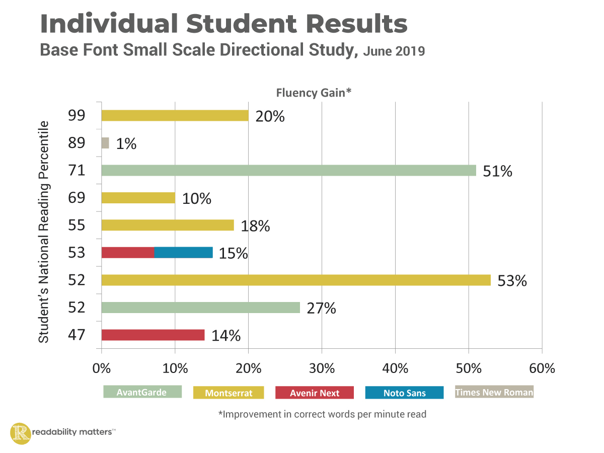
Third, consistent with previous studies, student reading level was not a predictor of text format sensitivity; performance gains were not correlated to the student’s national reading levels. For example, the 99th percentile reader experienced a 20% gain, while a 47th percentile reader got only a 14% gain.

Implications
Adding Readability Features to reading applications has the potential to dramatically increase reading performance and experience. The combination of base font with modifications to text size, character spacing, and character width expansion will allow a reader to increase reading performance (fluency and comprehension.)
Given the significant difference in base font results, Readability Matters recommends additional analysis and review prior to the selection of base font offerings and large-scale implementation.
Choosing the best set of base fonts is critical to maximizing the yield for each reader.
Notes
[1] Fluency is defined as the ability to read with speed, accuracy, and proper expression. In order to understand what they read, both children and adults must be able to read fluently whether they are reading aloud or silently. When reading aloud, fluent readers read in phrases and add intonation appropriately. (ReadingRocket.com)
[2] Basaran, M. (2013). Reading fluency as an indicator of reading comprehension. Educational Sciences: Theory & Practice, 13(4). 2287-2290. doi: 10.12738/estp.2013.4.1922
[3] The Lexile® Framework for Reading is a scientific approach to reading material level measurement.
[4] Running record is a common method of scoring a student’s reading fluency by systematically recording a student’s oral reading and noting any errors.
[5] The score for Avenir Next and Noto Sans was the same for one student.
Request a PDF version of the paper.


