Engineering Reading Themes for Diverse Audiences
Prior research has shown that personalization of text formats can significantly improve reading performance, creating better results in speed, accuracy, and comprehension. As these benefits are better understood, digital reading application providers are working to offer readers custom control over text settings, but adjusting the settings can be cumbersome.
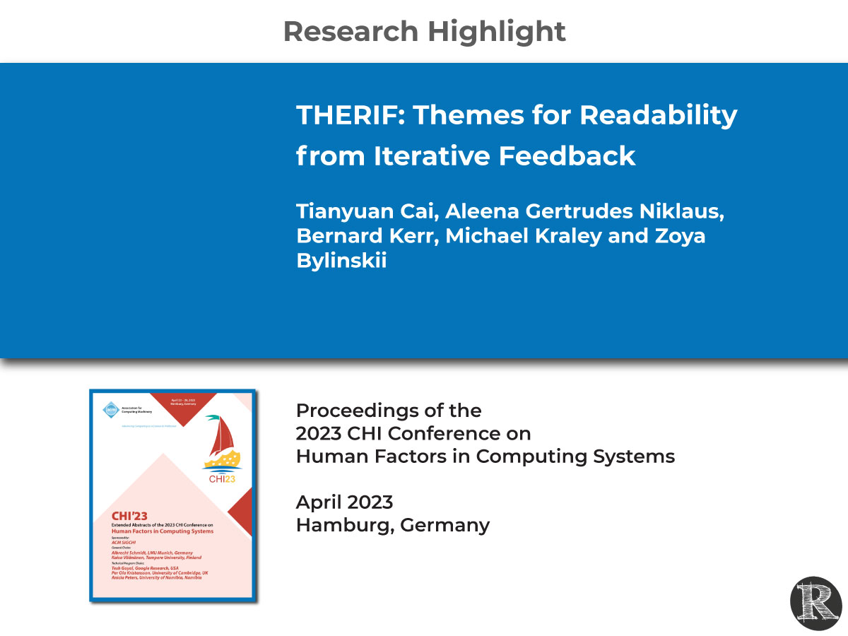
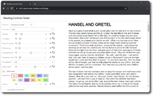
New Adobe Research, led by Tianyuan Cai, designed a user-centric approach to evaluate digital formats in groups of typographic characteristics, such as font, size, and spacing, which they call Reading Themes. All of these characteristics have been show to impact the readability of text, and ultimately the individual’s reading performance.
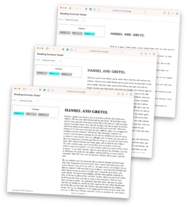
THERIF used an iterative feedback loop involving crowd workers, automatic clustering, and designer input to generate three reading themes—Compact, Open, and Relaxed—that offer different combinations of font and spacing (inter-character, word, and line).
In a study of over 800 participants, including people with dyslexia, researchers found that older participants preferred themes with larger spacing, while a significant proportion of participants with dyslexia preferred the Relaxed theme. A larger proportion of readers without dyslexia preferred the Open theme.
The authors concluded that THERIF is a successful pipeline for generating reading themes that meet the preferences of diverse readers. In the future, this approach can be used to suggest a set of reading settings, a reading theme, to a reader.
THERIF: Themes for Readability from Iterative Feedback was presented at the 2023 CHI Conference on Human Factors in Computing Systems and the 23rd Annual Meeting of the Vision Sciences Society.
Important for Readability Work
Tech and edTech companies are Implementing text format personalizations to improve reading performance, but there is more to learn. This emerging area of research seeks to assess the value of modifications to individual typography characteristics, but also the complex relationship of modifications to multiple characteristics simultaneously. For example, if Font A is determined to be best for a reader, would a different font with character spacing added produce a better result? Is Font A still the best for a reader if line spacing is increased? Modifiying a set of text characteristics quickly creates a myriad of options. How do size, shape and spacing options relate for an individual reader? Is there a key characteristic of the typography that should always be evaluated first?
Researchers Cai et al. developed a new approach that can facilitate reading personalization evaluation. The approach uses an iterative feedback loop that involves crowd workers, automatic clustering, and designer input. Their approach allowed them to create themes to deliver reading outcome improvements to diverse groups of readers. Starting with a theme and allowing an individual to personalize readability features (character spacing, width, line spacing, etc.) further may be a good solution.
While the relationships between typographic characteristics are not yet fully understood, grouping characteristics in ways that work for diverse segments of readers offers a model to simplify a very complex problem and move the readability work from research to implementation.
Learn More
-
- Tianyuan Cai’s CHI presentation:
-
- Earlier Work: Cai, T., Niklaus, A. G., Kraley, M., Kerr, B., & Bylinskii, Z. (2023). THERIF: A Pipeline for Generating Themes for Readability with Iterative Feedback (arXiv:2303.04221). arXiv. http://arxiv.org/abs/2303.04221
- Vision Sciences Society (VSS) Poster: THERIF: Diverse Reading Themes for Readability, presented by Dr. Ben D. Sawyer, Director, The Readability Consortium
Tianyuan Cai, Aleena Gertrudes Niklaus, Michael Kraley, Bernard Kerr, Zoya Bylinskii (2023, May 19-24). THERIF: Diverse Reading Themes for Readability, Vision Sciences Society, St. Pete Beach, Florida, USA. https://thereadabilityconsortium.org/wp-content/uploads/2023/05/therif_VSS_poster-1.pdf - Adobe Blog: New Adobe research examines user-centric designs for diverse digital reading needs
- Reading Themes Documentation and Experiments: https://therif.netlify.app/
- Demo for Desktop Reading: https://themes-demo.netlify.app/
THERIF: Themes for Readability from Iterative Feedback
Tianyuan Cai, Aleena Gertrudes Niklaus, Bernard Kerr, Michael Kraley and Zoya Bylinskii
ABSTRACT
Digital reading applications give readers the ability to customize fonts, sizes, and spacings, all of which have been shown to improve the reading experience for readers from different demographics. However, tweaking these text features can be challenging, especially given their interactions on the final look and feel of the text. Our solution is to offer readers preset combinations of font, character, word and line spacing, which we bundle together into reading themes. To arrive at a recommended set of reading themes, we combine crowdsourced text adjustments, ML-driven clustering of the resulting text formats, and design sessions. After four iterations of these steps, we converge on a set of three COR (Compact, Open, and Relaxed) themes that are designed for different readers.
Citation: Cai, T., Niklaus, A. G., Kerr, B., Kraley, M., & Bylinskii, Z. (2023). THERIF: Themes for Readability from Iterative Feedback. Extended Abstracts of the 2023 CHI Conference on Human Factors in Computing Systems, 1–11. https://doi.org/10.1145/3544549.3585679


