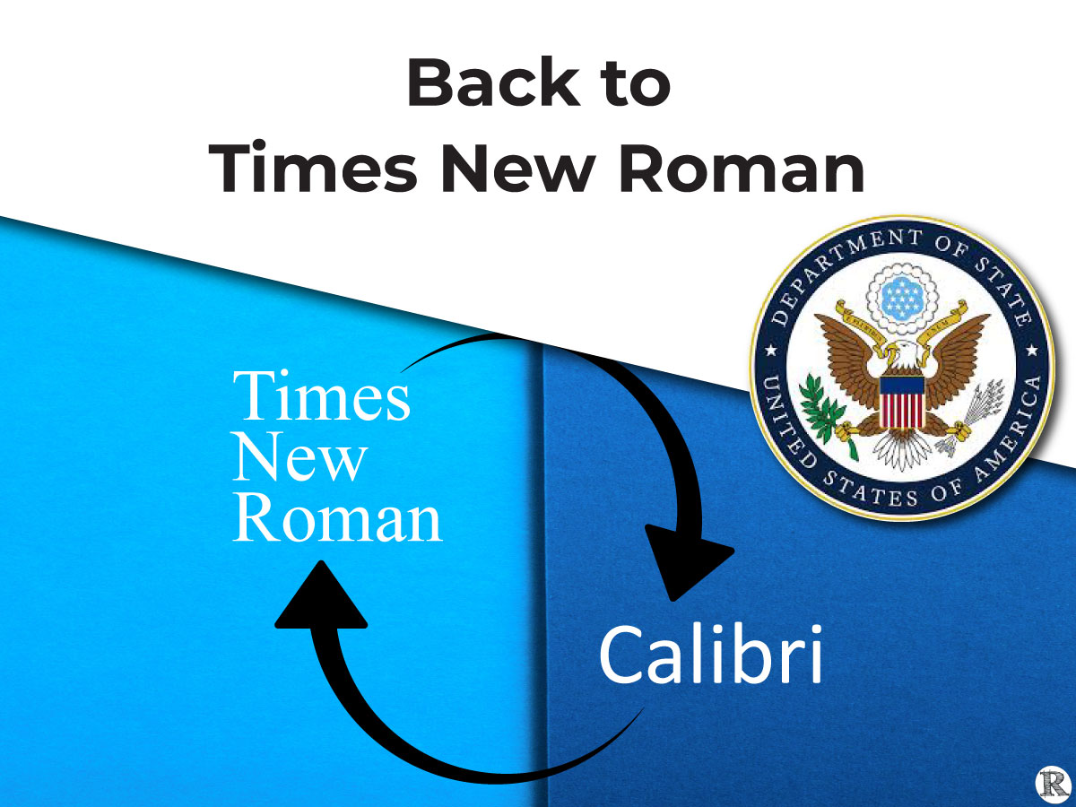
Secretary Rubio directed the State Department to use Times New Roman, reversing the Biden-era decision to switch to Calibri
Secretary Rubio directed the State Department to use Times New Roman, reversing the 2023 decision to switch to Calibri. Favoring cohesion, professionalism, and formality, the Department framed the change as a return to long-standing standards for official correspondence.
 Coverage of the decision extended beyond policy circles. As reported by The New York Times, the shift “shook one community far removed from the workings of government: type designers,” prompting broader discussion about how typography affects readability—particularly in digital contexts.
In its reporting, The New York Times consulted font experts, including Dr. Sofie Beier and Sam Berlow, both of whom are engaged in rigorous, multidisciplinary research focused on readability and reading performance through their work connected with The Readability Consortium.
While font is important, personalization matters most. One-format-fits-all should no longer be the de facto model of text presentation. Research supports the personalization of text format to improve reading speed, accuracy, and comprehension for most of the population.
Beyond letter shape and design, readability might be more important for matters of State.
“Readability is about comprehension and speed, and not about ‘Do you recognize this letter?’ Overall, the research time after time says Times New Roman is not a great performer compared to Georgia, Verdana, Helvetica or even Arial.”
Sam Berlow
Typographical Features are Critical
Letter shape, size, and spacing all meaningfully impact reading fluency and comprehension. Better readability is the gateway to enhanced learning and greater productivity.
“All these different aspects of the letters or the typefaces, they interact. Typeface design involves thousands of small decisions, all of which contribute to legibility.”
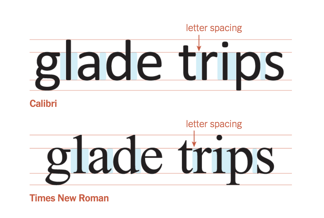
Sofie Beier, PhDClick to enlarge. Source: New York TImes, 2026
“There is a sort of conventional wisdom that serifs make things easier to read in long-form text. I used to believe that. I don’t really anymore, I think the more important aspect is the proportion of the letters and the amount of space in between them. And in that respect, Calibri does quite well in text and especially text on a screen, which I suspect was part of the previous decision to switch.”
Tobias Frere-Jones
Again, is this the Right Debate?
We don’t think so! The question is not ‘Times New Roman or Calibri?’ nor is it ‘serif or sans-serif font?’ nor is it ‘formal or informal?’ The only question that makes sense in light of recent research is whether it should be one-format-fits-all or personalized text. Technology makes personalization possible.
Personalization matters. One-format-fits-all should no longer be the defacto model of text presentation.
Imagine a world where every digital screen automatically adjusts to the reader, where evidence-based typography boosts readers speed and comprehension.
For the last five years, a global network of scientists, designers, and engineers has been working to make that world a reality. Our readability research community has grown from a handful of passionate experts to a community of over 200 stakeholders from around the globe.
Learn more about the growing research community working to bring better reading to the world. See the Wiki describing the work of The Readability Consortium, Adobe, Google, Monotype, the University of Central Florida, and more. Together they are developing research-informed solutions to make each reader the best reader they can be.
For Additional Context
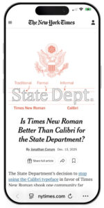
The New York Times
2023: Citing Accessibility, State Department Ditches Times New Roman for Calibri
2026: Is Times New Roman Better Than Calibri for the State Department?