New Readability Study Finds Personalizing Text Formats Improve Reading Outcomes
Published in the proceedings of the Computer Human Interaction (CHI) Conference 2020, was this study of font as a factor in accelerating adult reading. The 63 participants were aged 18-55; they were 12 university students and 51 from digital testing platforms. Those with low comprehension scores were removed, leaving a population of skilled readers.

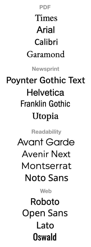
The 16 fonts used in the study.
The Study
The sixteen fonts studied were selected based on their popularity and diverse use cases. Fonts were not adjusted for their inherent differences in size, spacing or proportion.
The study was designed to test both font preference and effectiveness. The authors evaluate the fonts in a number of ways, defining new and interesting ways to compare the results. Preference was tested with a toggle task comparing a set of fonts. Font effectiveness was assessed based on reading speed (words per minute) and comprehension measured as questions answered correctly.
Results
Noto Sans, Montserrat, and Garamond were the winners in the reader’s font preference tests. It was noted that Garamond had the most inter-participant disagreement. (Some very high, some low scores.)
Noto Sans and Lato are the winners when the combination of reading speed and comprehension score is the measure. Across the full set of measures, the authors name Noto Sans the “clear favorite.”
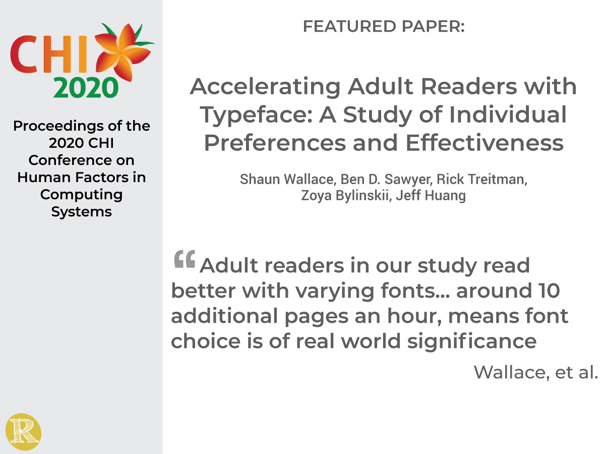
“People read 51% faster in their fastest font compared to their slowest font. This translates to potential gains of 10 additional pages of reading per hour! Given these gains and our finding that different fonts are effective for different people, there is an exciting opportunity to build custom reading experiences and augment reading performance for adult readers.”
Wallace, et al.
The Implication for Readability
Wallace et al. demonstrate (1) significant differences in the fastest font compared to the slowest font for an individual reader, and (2) that different fonts are the fastest for different participants. Readability Matters advocates for the addition of Readability Features to text reading apps; allowing readers to change the font to the font that makes them the best reader they can be, creates significant value as the study highlights.
The authors note that the more interesting the reader thought the passage was, the slower they read. This observation has interesting implications. If readers tend to slow down when they are interested, does that change how we think about reading speed as a measure? Can a better font cause the information to seem more interesting, and will that slow the reader down?
Readability Matters has long talked about the benefits of Readability enhancements as including more readers, reading more, and reading longer, expanding markets for publishers. Study results include an observation that a reader’s preferred font was seldom best. Is there a relationship to the above? Does the reader slow down because he is enjoying the reading more with the preferred font? And, will the reader read longer if they enjoy the experience more, allowing them to ultimately take in more information?
We look forward to the future work of the authors!
Read the full paper here.
Accelerating Adult Readers with Typeface: A Study of Individual Preferences and Effectiveness
Shaun Wallace, Ben Sawyer, Rick Treitman, Zoya Bylinskii, Jeff Huang
ABSTRACT
Information overload is the challenge of the modern era and text the medium. Every adult reader would benefit from faster reading, provided they could retain comprehension. The present work explores the reading speed gains possible solely by manipulating typeface. We consider that optimal typeface might be a matter of an individual’s preferred font, or that some fonts might be better for all users. Indeed, eight in ten of our participants believed their favorite font would be their best. Instead, our findings showed that the preferred font was seldom best, and one font did not fit all. Adult readers in our study read better with varying fonts. An average 117 word per minute difference between worst and best typeface, or around 10 additional pages an hour, means font choice is of real-world significance. Our discussion focuses on the challenges of rapidly identifying an individual’s optimal font, and the exciting individuation technologies such an advance allows.


