Study Measures the Differences in Glance-Based Legibility of Eight Sans-Serif Typefaces
In a paper published in Ergonomics, the International Journal of Research and Practice in Human Factors and Ergonomics, Sawyer, Dobres, Chahine and Reimer compared differences in glance-based legibility of eight sans-serif typefaces. Their research demonstrates that differences measured in milliseconds are significant in time-pressured situations, such as driving.
The Bake-Off, Comparing Font Characteristics

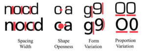
Key design differences of Eurostile (top row) and Frutiger (bottom row): Eurostile’s tight spacing, closed letter shapes, and highly uniform contours and proportions contrast with those of Frutiger. Click to enlarge.
The authors note that “typefaces with more open shapes and contours outperform typefaces with more closed ones” across the population tested. The paper includes a section on the typographic factors that may be important in realizing the differences in performance including letter size, spatial frequency, polarity, serif/sans-serif, etc.
Similar Fonts Yield Significantly Different Results
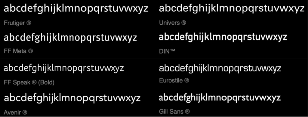
The authors note that very little “work addresses legibility threshold differences between typeface, considering seemingly subtle design differences between ostensibly similar typefaces.” While to the casual observer, there are only minor differences in the eight fonts studied, the researchers find that the very subtle differences in typography factors drive meaningful variation in results. They reference additional studies revealing that “the choice of typeface matters and that the magnitude of difference is enough to make real impact in a variety of real-world situations.”
The results show typography to be ore than a matter of taste, especially in safety-critical contexts…
Sawyer, et al.
And, the Winner Is…
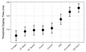
Which font won the bake-off? Of the eight tested, Frutiger was the font with the smallest amount of display time needed to read with the targetted level of response accuracy. The authors note, “The method of comparing fonts tests each typeface in practice and results reflect responses to the totality of its design. As such, it is not possible to make generalised statements as to why certain typefaces are performing better than others, but simply that they are.”
The Implications for Readability
Readability Matters is interested in following the future work of the authors.
- We look forward to any future assessment of the data from the individuation perspective. What does the distribution of “best” look like across individuals, rather than aggregated for all? Is there a set of winners?
- While the typeface design controls shape openness and form variation, Readability Matters notes that the spacing width and proportion variation variables can be controlled with Readability Features, offering reader optimization opportunities.
- As the authors observed, it is difficult to make statements as to why certain typefaces are performing better than others. As future studies are structured to look at the disaggregation of individual Readability Features, and then examine the intersection of those features, we will learn more about creating the best format for an individual.
- In certain applications, (we have heard Dr. Sawyer talk about street signs, for example,) aggregate data provides clear implementation direction. As we look to a world that is increasingly more digital and personalized, is it possible that drivers will be presented with vehicle user interfaces optimized for themselves? Will an optimized display reduce traffic accidents and, ultimately, fatalities?
The paper’s abstract is included below; see the full paper here.
The Great Typography Bake-off: Comparing Legibility At-A-Glance
Ben D. Sawyer, Jonathan Dobres, Nadine Chahine & Bryan Reimer
ABSTRACT
Typography plays an increasingly important role in today’s dynamic digital interfaces. Graphic designers and interface engineers have more typographic options than ever before. Sorting through this maze of design choices can be a daunting task. Here we present the results of an experiment comparing differences in glance-based legibility between eight popular sans-serif typefaces. The results show typography to be more than a matter of taste, especially in safety critical contexts such as in-vehicle interfaces. Our work provides both a method and rationale for using glanceable typefaces, as well as actionable information to guide design decisions for optimised usability in the fast-paced mobile world in which information is increasingly consumed in a few short glances.
PRACTIONER SUMMARY
There is presently no accepted scientific method for comparing font legibility under time-pressure, in ‘glanceable’ interfaces such as automotive displays and smartphone notifications. A ‘bake-off’ method is demonstrated with eight popular sans-serif typefaces. The results produce actionable information to guide design decisions when information must be consumed at-a-glance.


