Readability Creates Better Reading Experiences
To explore the difference between legibility and readability of reading material, it is important to understand that legibility is a key component of readability.
Legibility is an informal measure of how easy it is to distinguish one letter from another in a particular typeface.

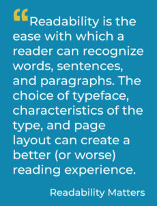
Readability is about the reader – the ease with which a reader can successfully decipher, process, and make meaning of the text read. Typographical features of the text are critical; letter shape, size, and spacing all meaningfully impact fluency and comprehension. The choice of typeface, characteristics of the type, and page layout can create a better (or worse) reading experience. Better readability is the gateway to enhanced learning and greater productivity. (See the Readability Tech Tips page to see the Readability Features available in apps today.)
Good (more readable) typography encourages a desire to read the words and reduces the effort required to read and comprehend the material. Type should not distract the reader. The reader should not notice the type but simply understand the words.
“Legibility” is based on the ease with which one letter can be told from the other.
“Readability” is the ease with which the eye can absorb the message and move along the line.—J. Ben Lieberman “Types of Typefaces” (1968)
See the Difference in Readability

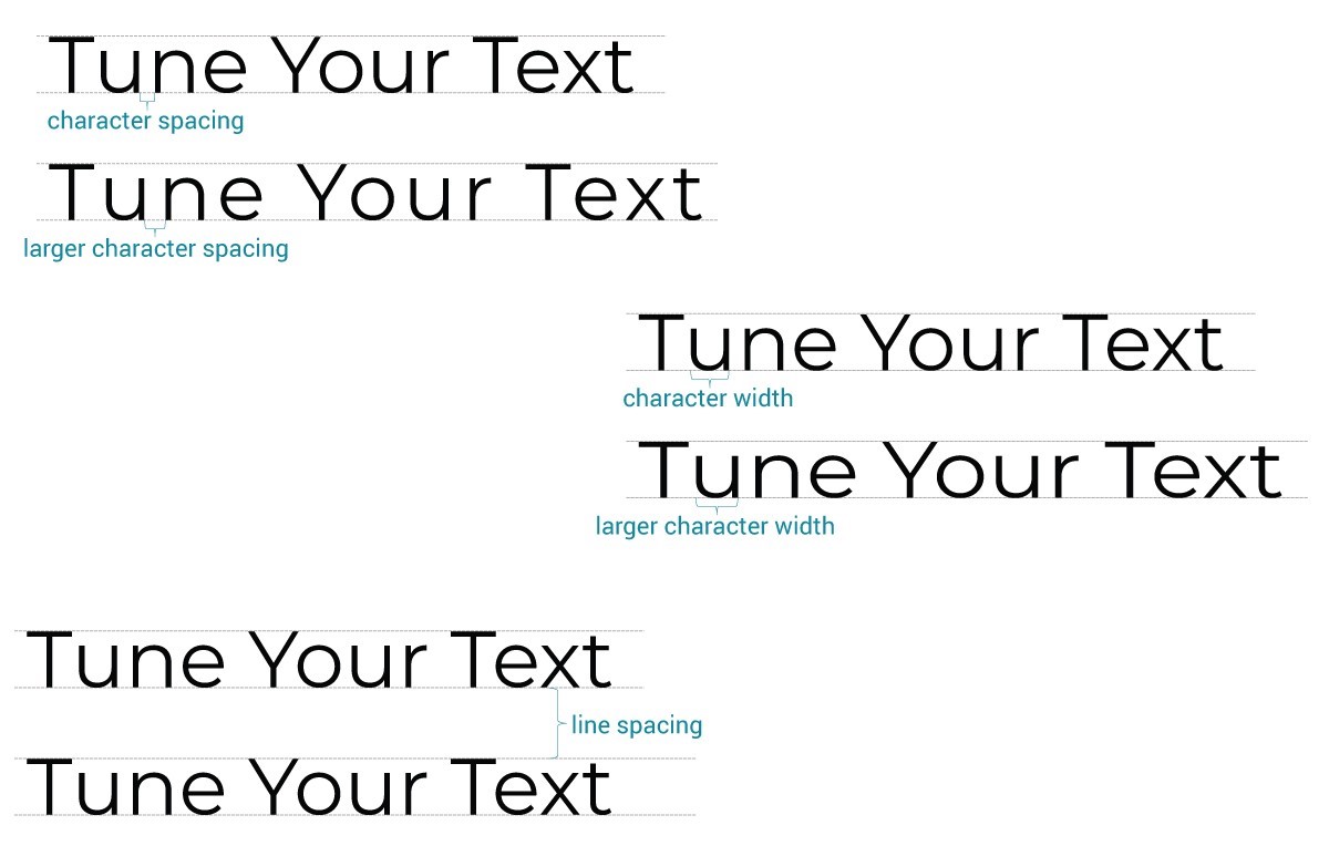
This text is all the same size (height, measured in points.) Notice how differently your eye perceives the characters when extra character spacing is added, or when the characters are widened. Likewise, some individuals read more effectively with increased line spacing. These are all examples of characteristics that impact the readability of text differently for individuals.
Learn more about tuning your text for better readability.


