New Google Study Evaluates the Impact of Adjusting Font Grade on Readability in Light and Dark Polarities
We want to encourage people to read in ways that will help them to effectively engage with the digital environment.
Palmén, et al.
Readers read for different purposes, such as checking the time, enjoying a novel, or accessing the wealth of information available in this digital era. Their reading strategies vary accordingly. Regardless of a reader’s motivation, improved reading performance is valuable.
Readability research confirms the importance of small typographical changes to text formats in an individual’s ability to read quickly, accurately, and with greater comprehension. However, there is still much to learn for technology advances to bring personalized reading improvements to websites and software applications.
Hilary Palmén, Michael Gilbert, and David Crossland of Google presented their new research, How bold can we be? The impact of adjusting font grade on readability in light and dark polarities, at the leading international conference on Human-Computer Interaction, ACM CHI’23.
Research Objective
The research objective was to explore the effect of changes to font grade on readability in both light mode and dark mode environments.
Method
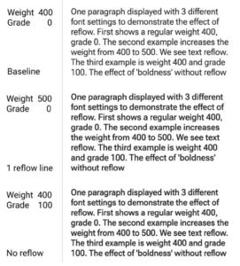
The team adjusted font grade levels using variable font technology. Font grade is an axis found in some variable fonts that can be used to alter stroke thicknesses without affecting the type’s overall width, or inter-letter spacing—unlike altering weight. Especially important in user interface design, grade adjustments do not cause changes to line breaks or page layout.
The team notes that reading speed is not always the best metric for measuring reading comprehension and should not be used in isolation to assess reading comprehension. They argue that there are a number of factors that can affect reading speed, such as the difficulty of the text, the reader’s familiarity with the topic, and the reader’s motivation. As a result, the research design included these factors.
They conducted two studies with a total of 459 participants. In the first study, participants were asked to complete a glanceable reading task with word pairs displayed on a desktop computer screen. Participants were asked to complete a paragraph reading task on a mobile device screen in the second study.
Results
The researchers found that variable font grade adjustments can be used to improve the readability of glanceable text on a computer. However, the authors concluded that further research is needed to determine the optimal grade settings for fonts in different reading contexts.
Important for Readability
The Google team systematically used variable font adjustments to study how typographical changes affect reading. They assessed users’ behaviors by calculating words per second and eye-tracking fixation duration. This allowed them to understand how typography changes readers’ strategies and experiences. The results can provide a framework for studying other typographical features, (such as font, character width, character and line spacing, etc.) which will enable the development of better reading experiences across reading surfaces.
Variable fonts, a new and exciting technology, are key. These fonts can be adjusted for countless variations and user preferences. They have the potential to revolutionize user interaction with typography, delivering better reading outcomes. Developers can use them to allow their users to alter the appearance of text with high-fidelity results. As more software applications and devices make use of variable fonts, readers will be offered new possibilities for text format personalization.
The Speed/Comprehension Trade-off
The authors note that they found the expected effects of people reading interesting paragraphs more slowly; they moderate their speed and slow down to engage with the content. Their discussion includes the observation that “Slower readers might be applying personally relevant reading strategies to create their preferred engagement with the text. Maybe some readers intentionally choose slower reading strategies as an overall approach, while everyone adjusts [speed/comprehension tradeoffs] for interesting or unfamiliar topics.” [1]
These concepts are critical to readability research. We must not assume that if a reader slows down that the text format is necessarily bad for the reader. Perhaps they slow down because the text is easier to comprehend and the reader is engaging more deeply with it. This is a challenge for readability researchers. Readers definitely slow down when the typography is difficult for them to read. They may also slow down because they are enjoying the process of reading and learning more.
[1] Shimoda, T. A. (1993). The Effects of Interesting Examples and Topic Familiarity on Text Comprehension, Attention, and Reading Speed. The Journal of Experimental Education, 61(2), 93–103. https://doi.org/10.1080/00220973.1993.9943854
Learn More
Variable fonts will change the very nature of typography: How grade impacts readability
Learn about two research experiments at Material Design to determine how light and dark modes affect users when it comes to reading different typographical presentations of a variable font called Robotoflex. Researchers cover their experiment design and findings.
How bold can we be? The impact of adjusting font grade on readability in light and dark polarities
Hilary Palmén, Google LLC, Michael Gilbert, Google LLC, David Crossland, Google LLC
Abstract
Variable font file technology enables adjusting fonts on scaled axes that can include weight, and grade. While making text bold increases the character width, grade achieves boldness without increasing character width or causing text reflow. Through two studies with a total of 459 participants, we examined the effect of varying grade levels on both glancing and paragraph reading tasks in light and dark modes. We show that dark text on a light background (Light Mode) is read reliably faster than its polar opposite (Dark Mode). We found an effect of mode for both glance and paragraph reading and an effect of grade for LM with heavier, increased grade levels. Paragraph readers are not choosing, or preferring, LM over DM despite fluency benefits and reported visual clarity. Software designers can vary grade across the tested font formats to influence design aesthetics and user preferences without worrying about reducing reading fluency.
Hilary Palmén, Michael Gilbert, and David Crossland. 2023. How bold can we be? The impact of adjusting font grade on readability in light and dark polarities. In Proceedings of the 2023 CHI Conference on Human Factors in Computing Systems (CHI ’23), April 23–28, 2023, Hamburg, Germany. ACM, New York, NY, USA 11 Pages. https://doi.org/10.1145/3544548.3581552
 ABOUT ACM SIGCHI: The Association of Computing Mechanics Special Interest Group on Computer-Human Interaction is the world’s largest association of professionals who work in the research and practice of computer-human interaction. We are an interdisciplinary group of computer scientists, software engineers, psychologists, interaction designers, graphic designers, sociologists, multi-media designers, and anthropologists, just to name some of the domains whose special expertise come to bear in this area. What brings us together is a shared understanding that designing useful and usable technology is an interdisciplinary process, and when done properly it has the power to transform persons’ lives. SIGCHI has close to 65 active local chapters across five continents, to promote local support networks for HCI professionals. SIGCHI members receive registration discounts to SIGCHI-sponsored and co-sponsored conferences, a subscription to the “Interactions” magazine, electronic access to the TOCHI journal, and the monthly electronic ACM SIGCHI TechNews. SIGCHI membership also grants access to all SIGCHI publications in the ACM Portal.


